
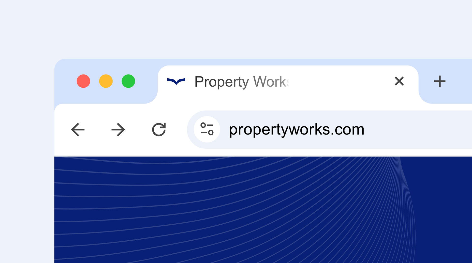
The Challenge: Bridging the Gap Between Legacy and Longevity:
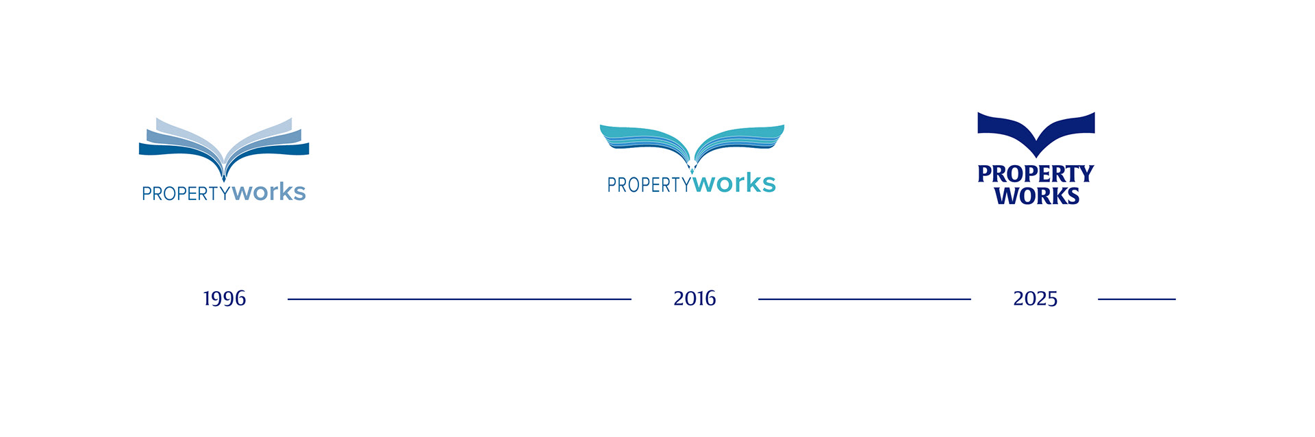
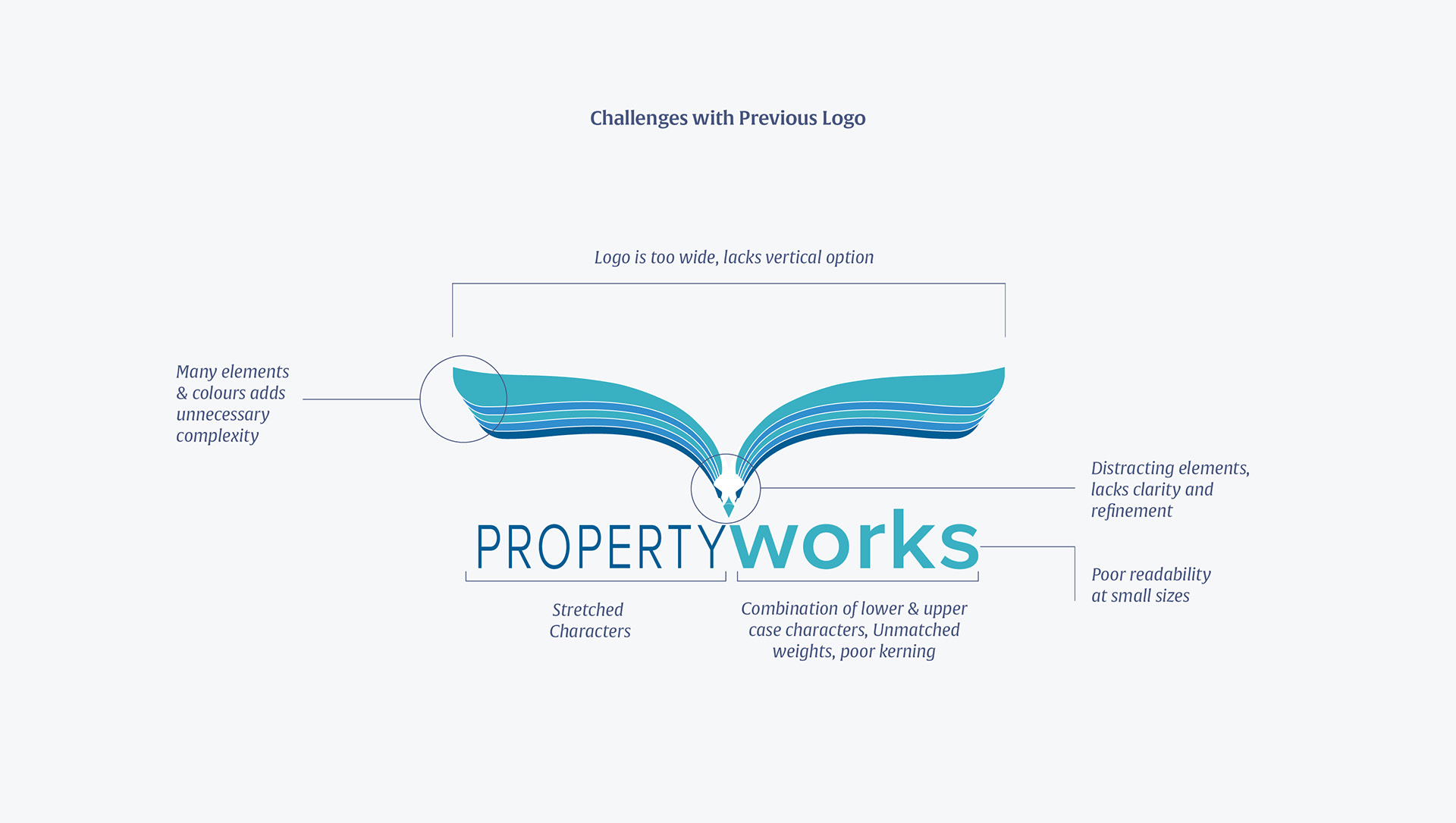
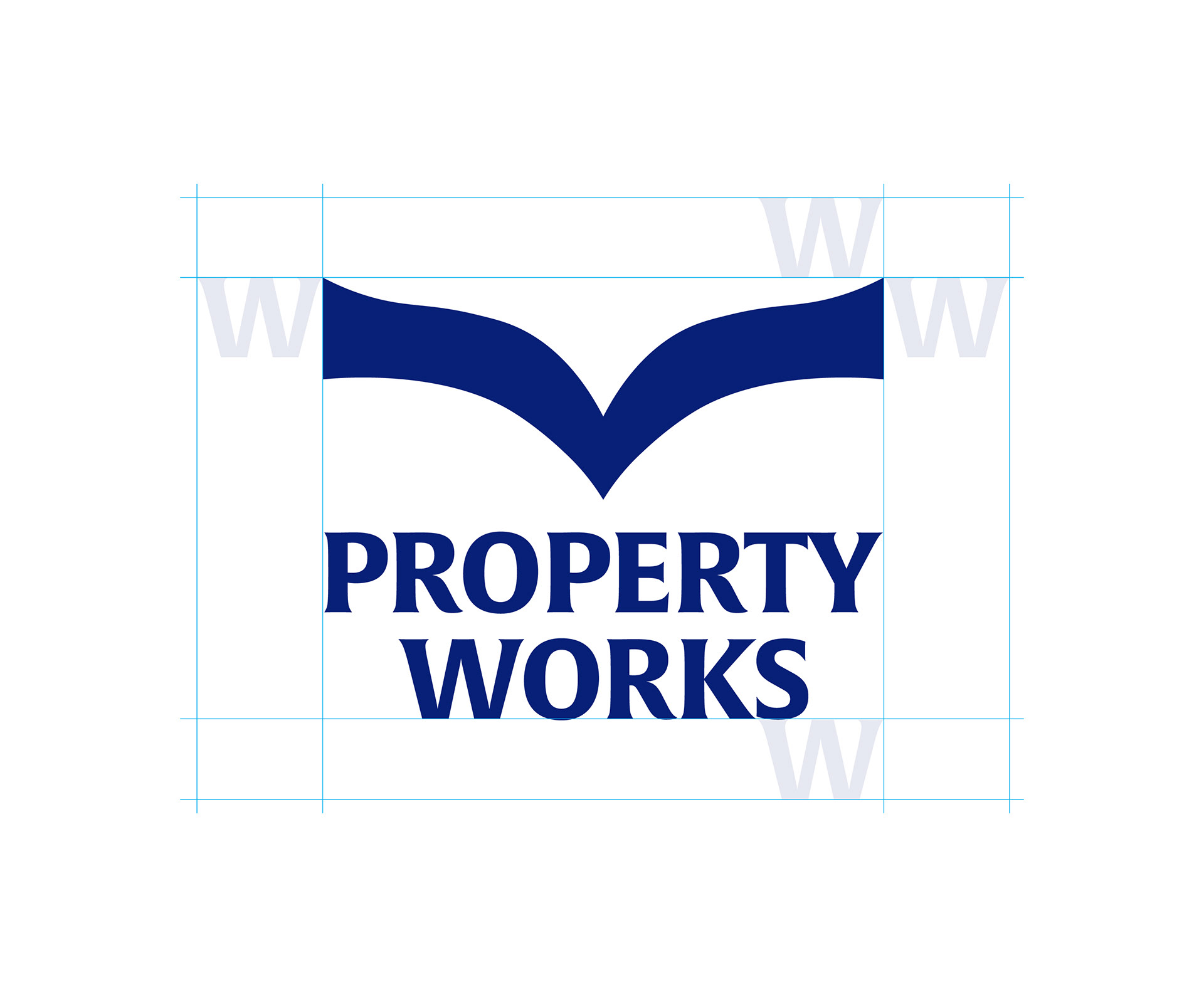
For nearly 30 years, Property Works has been a consistent force in the industry. However, the company faced a significant challenge: a visual identity that had become inconsistent over time. While the original logo held a strong conceptual foundation, its execution no longer aligned with the company’s evolving internal goals and brand voice. Furthermore, the existing visual system lacked the strategic depth required for their current market position; specifically, the colour palette and typography, while contemporary, did not fully support the company’s long-term objectives. This visual fragmentation hindered their ability to project a unified and premium market presence.
As the Design Consultant leading this internal initiative, I was tasked with establishing a new visual direction to strategically position Property Works for the decades ahead. Collaborating closely with the Marketing Manager, who served as the Brand Strategist, we committed to a fundamental assessment of the brand. We scrutinised every existing visual element to ensure that the new identity was built on intention.
While our initial objective was a standard brand refresh, the insights gathered from our deep-dive analysis revealed a more profound need for change. Recognising that a superficial update would not address the core strategic misalignments, we made the intentional decision to transition to a complete, ground-up redesign. This pivot allowed us to develop a cohesive, future-proof identity that accurately reflects Property Works’ vision and reinforces its stature in the market.

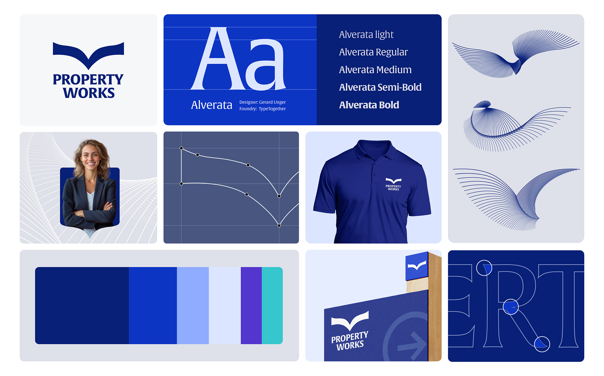
Typography:
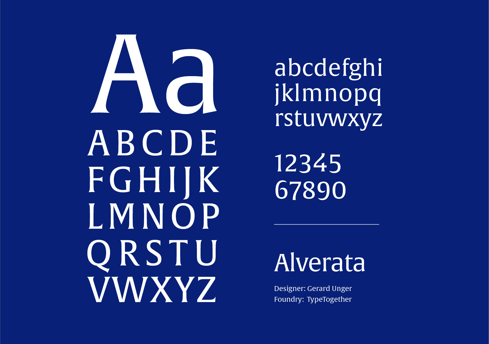
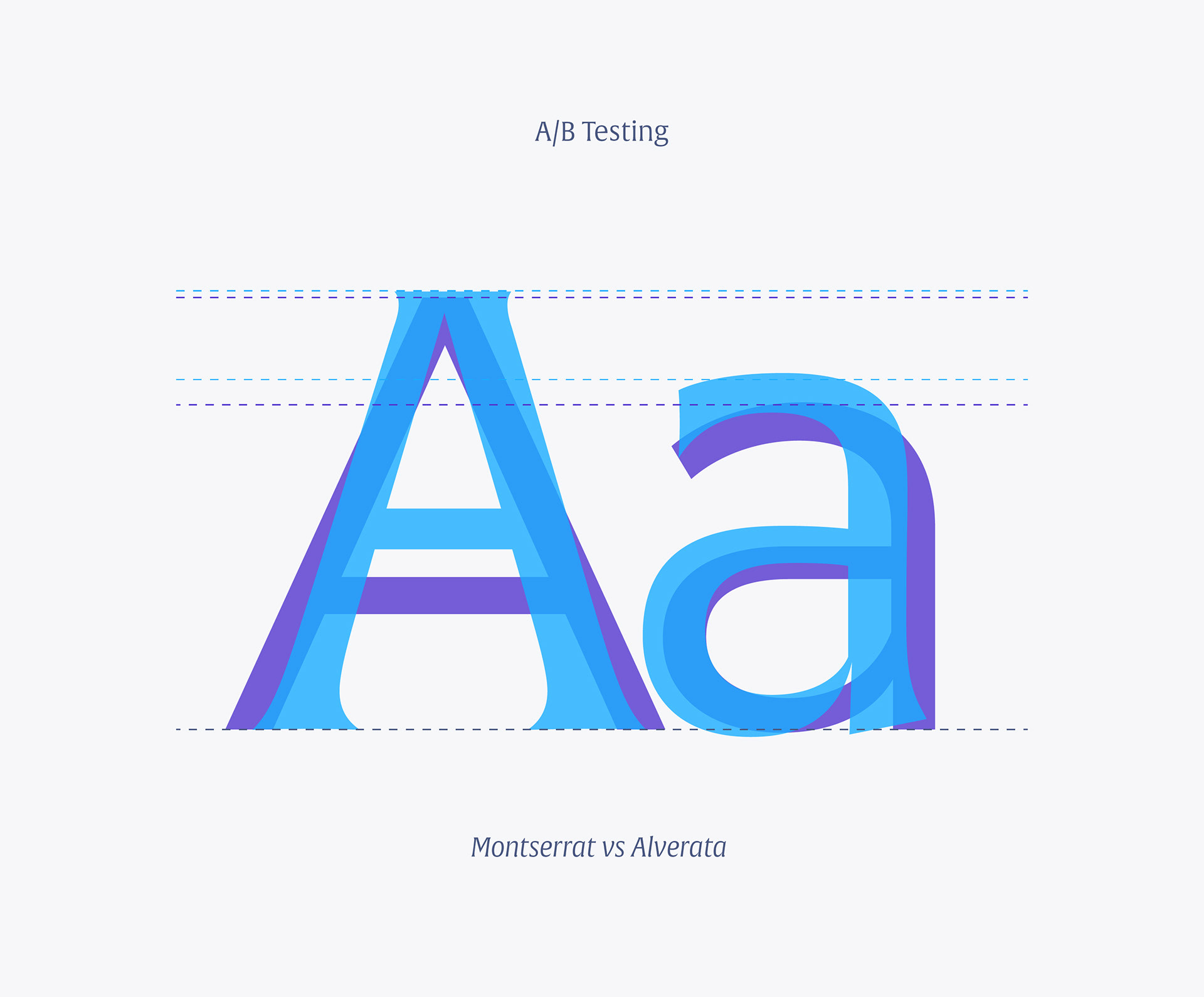
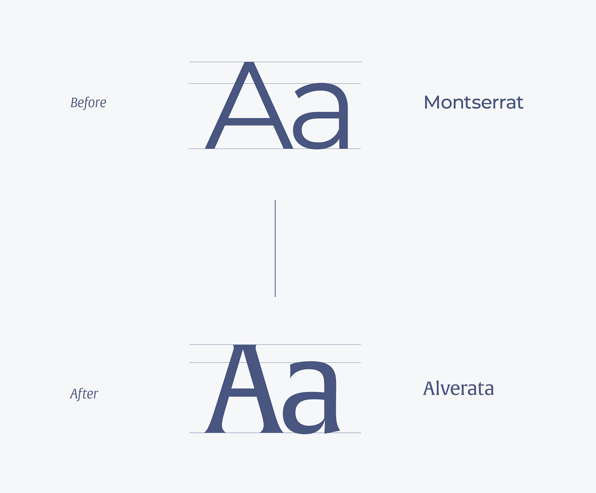
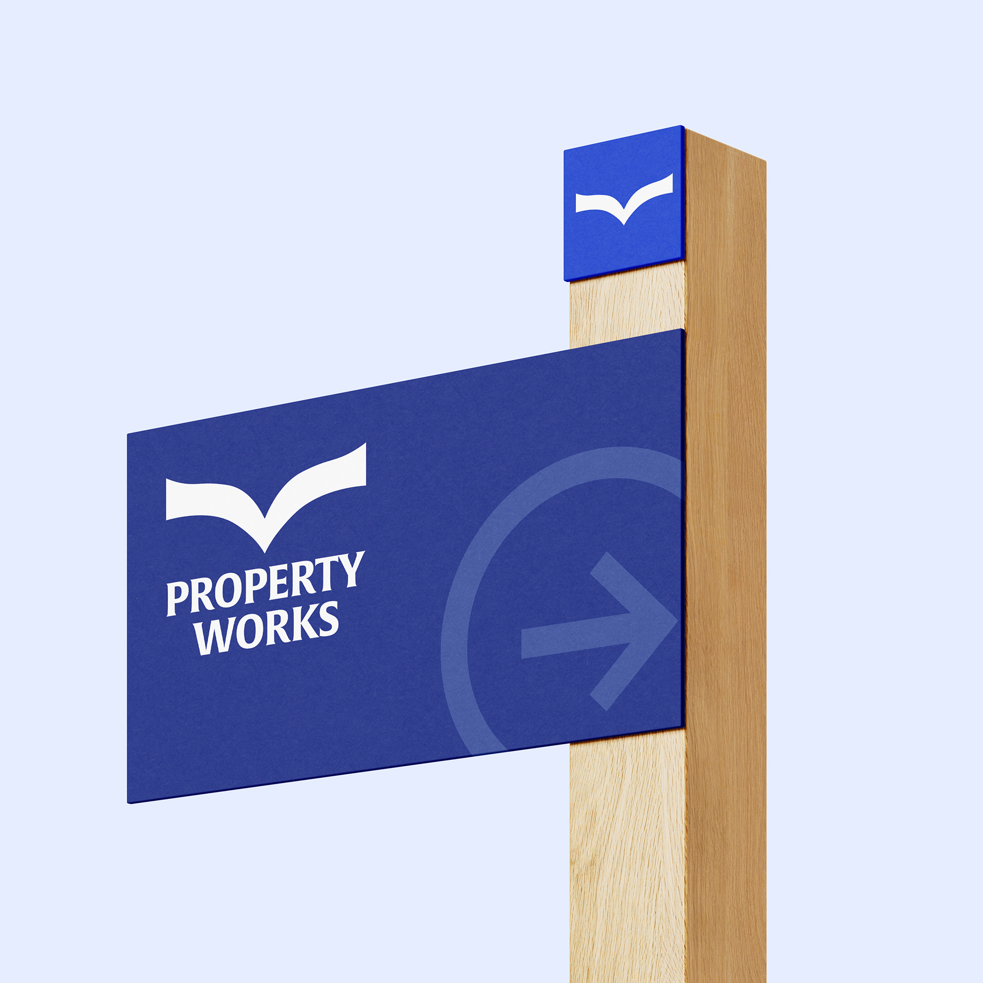
Typography played a pivotal role in refining the brand's voice. As a highly respected B2B leader in lease management, Property Works required a visual tone that was both authoritative and distinct. We made the decision to move away from Montserrat; while functional, it ultimately lacked the specific personality required to elevate the brand.
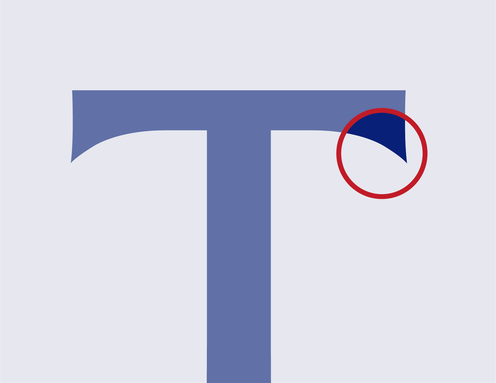
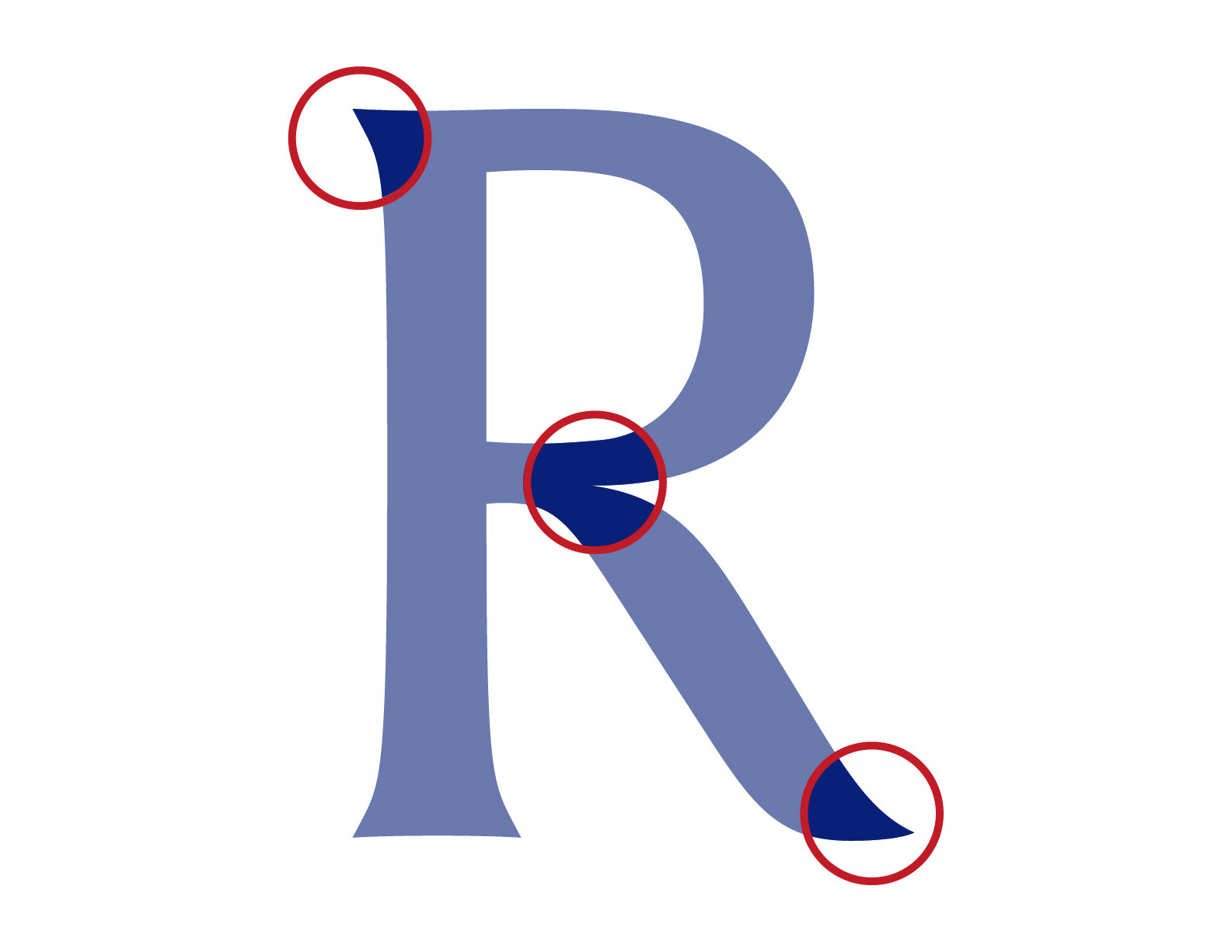
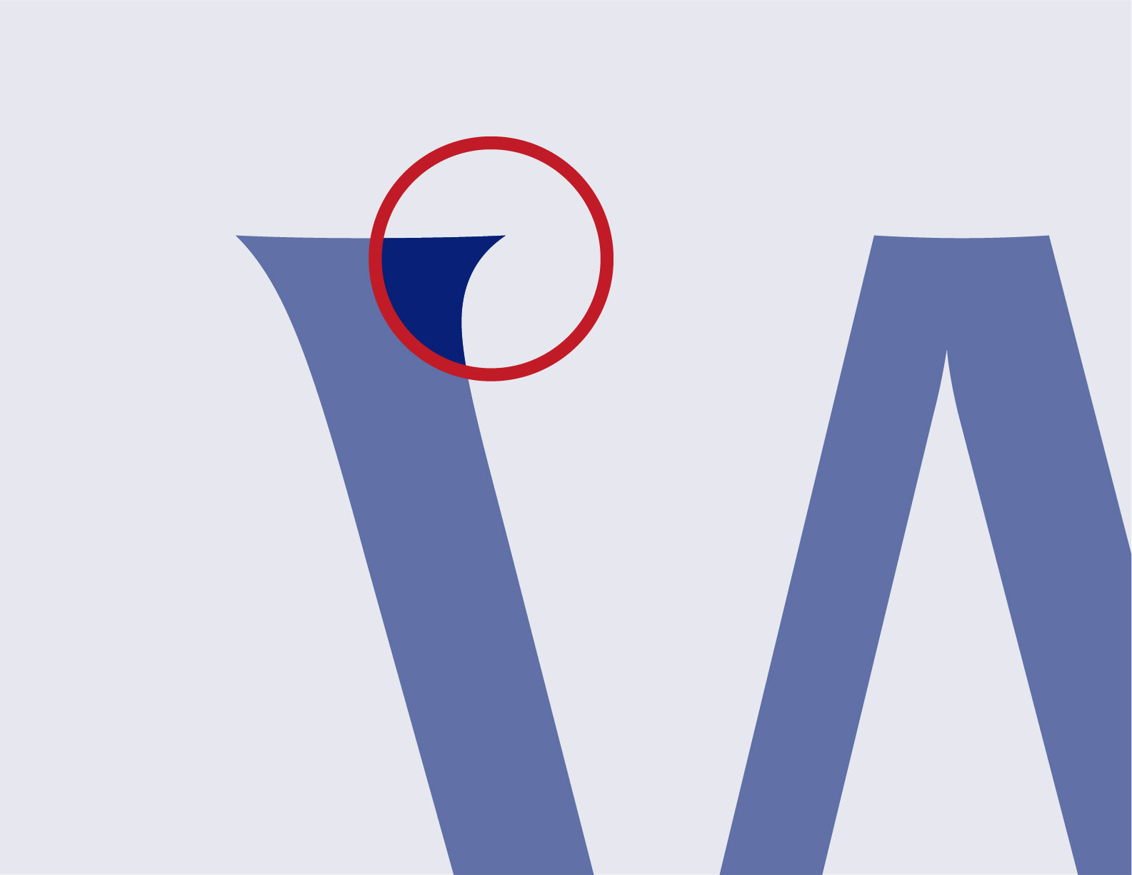
In its place, we selected Alverata for three key reasons. First, as a serif typeface, it provides an immediate sense of professionalism and history that resonates with the company's target audience. Second, its low-contrast letterforms conveys a sense of boldness and confidence—traits essential for an established industry player. Finally, Alverata’s unique terminals and details echo the geometry of the new logo, creating a seamless and cohesive brand personality across the entire design system.
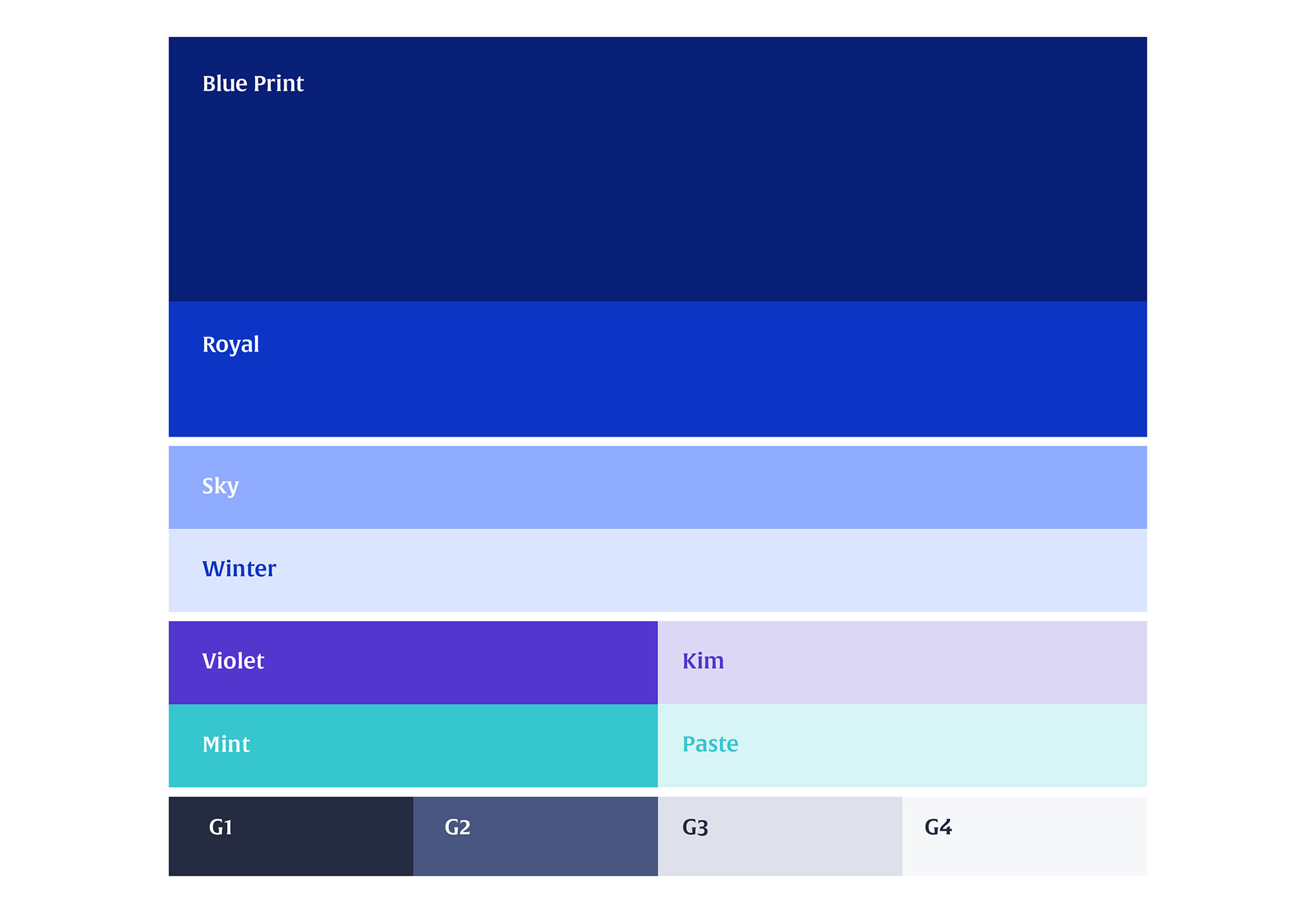
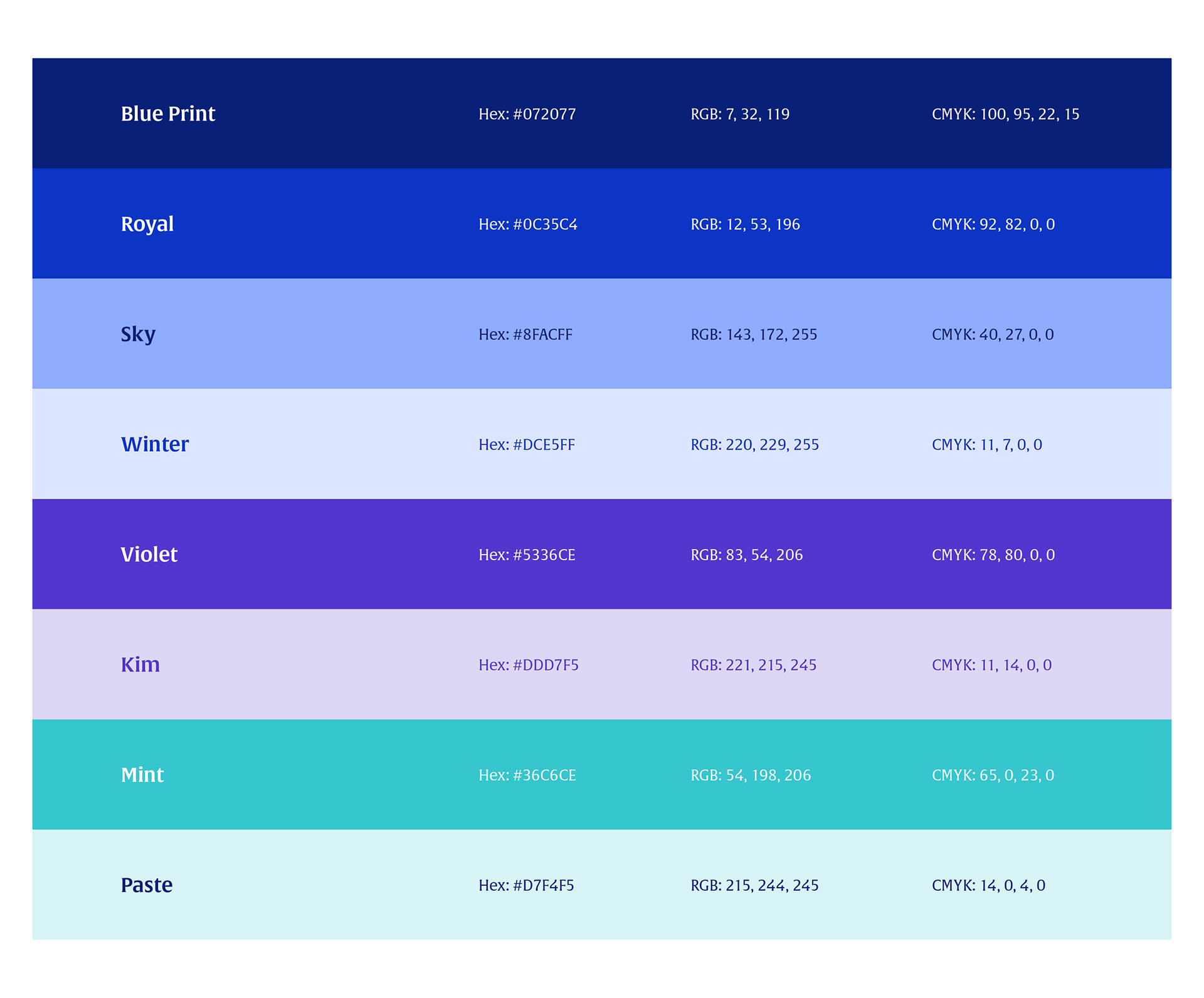
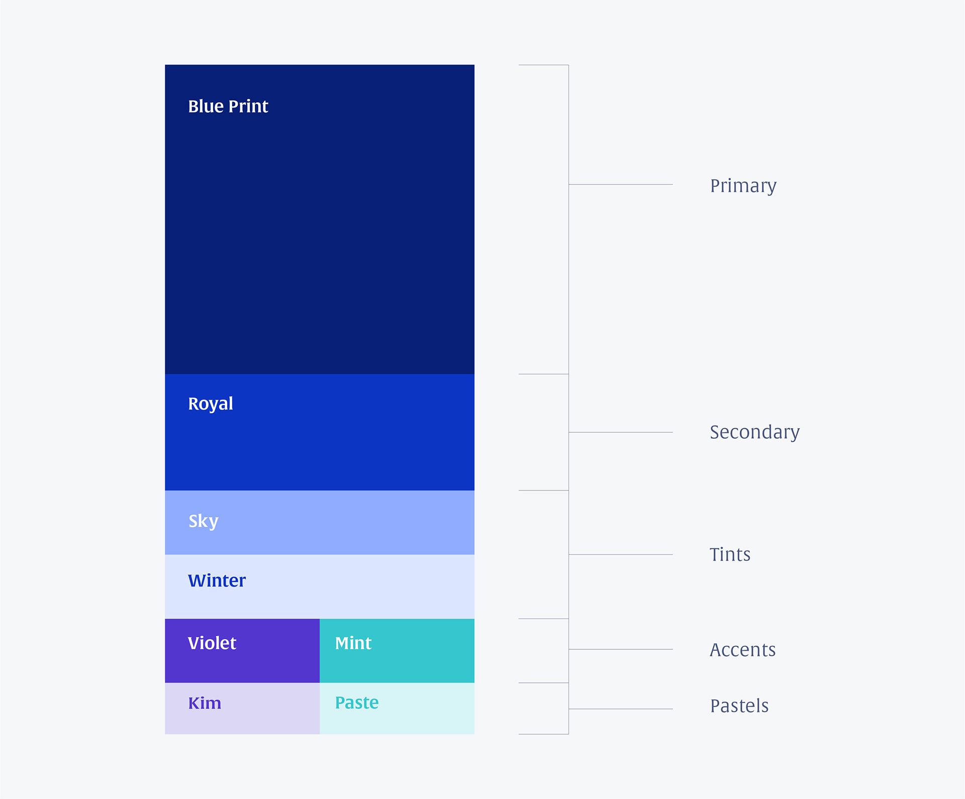
Colour

Frames

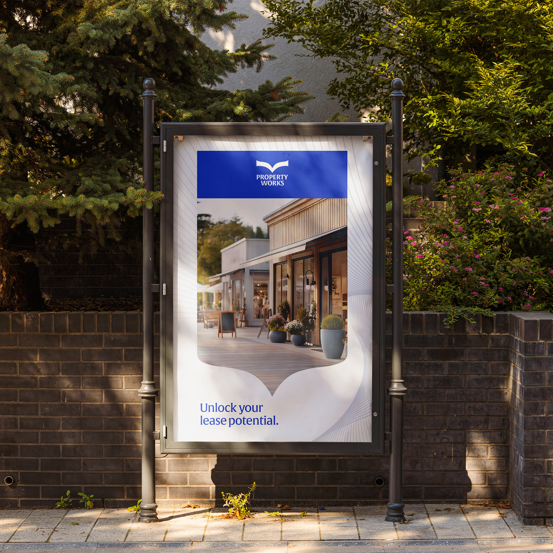
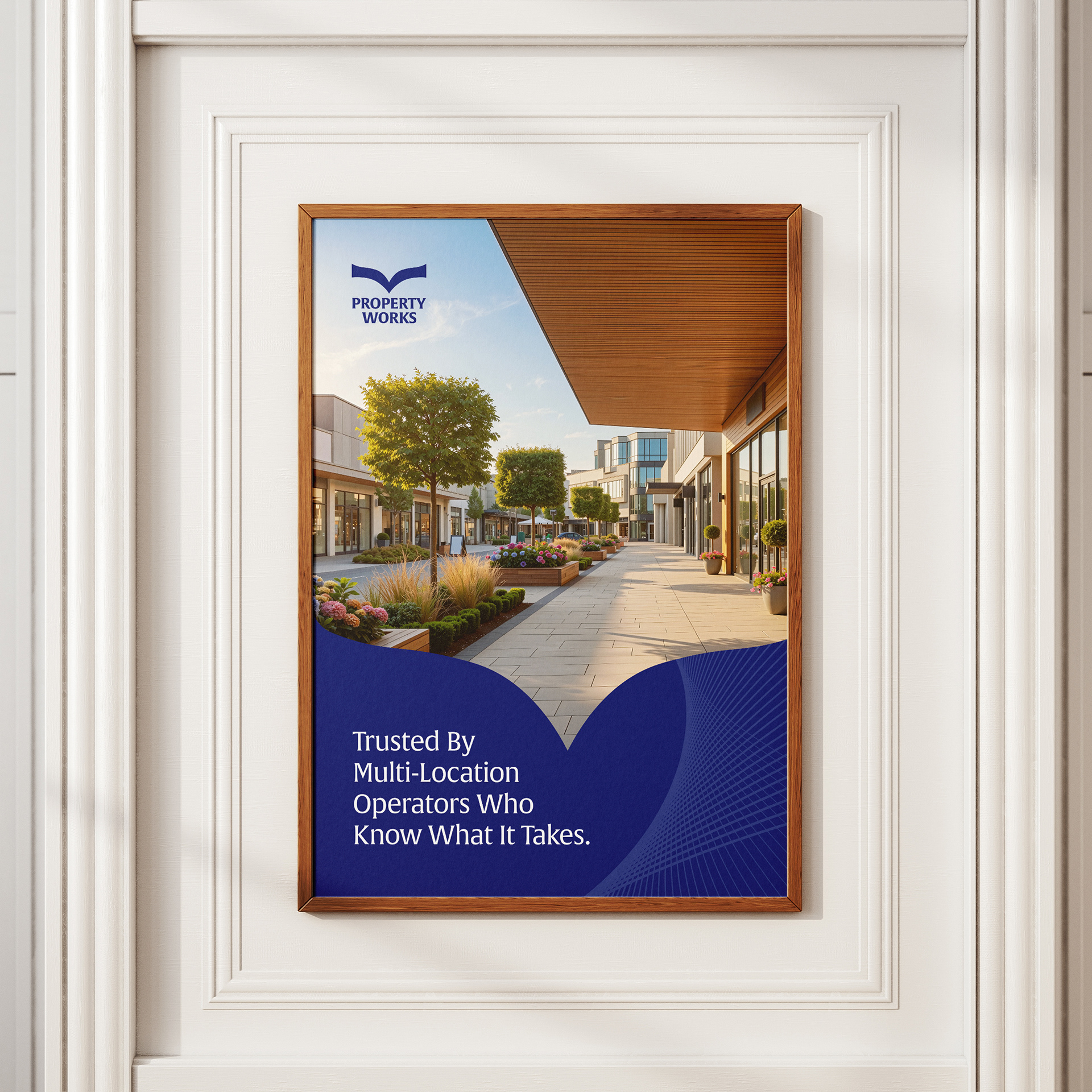
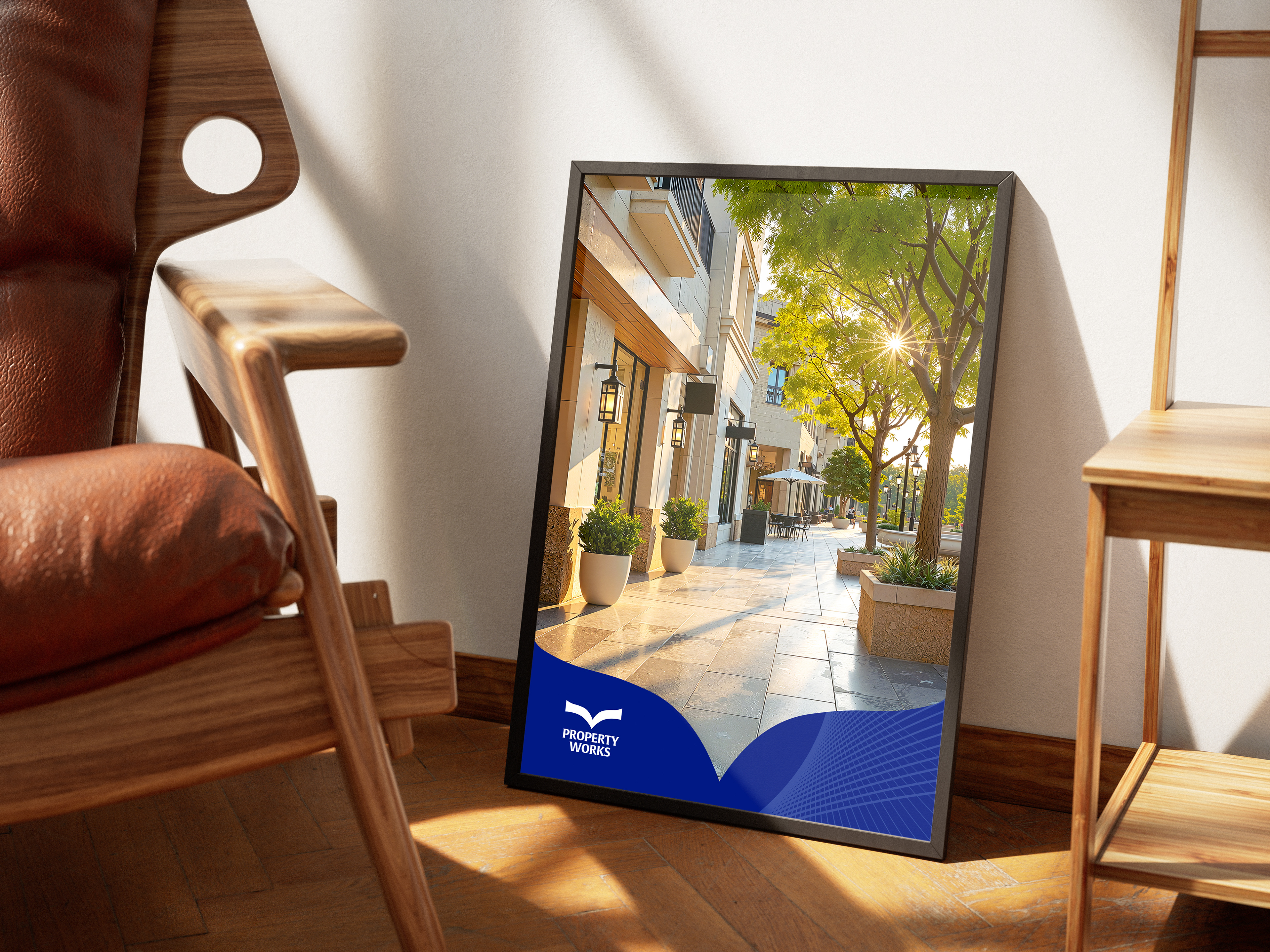
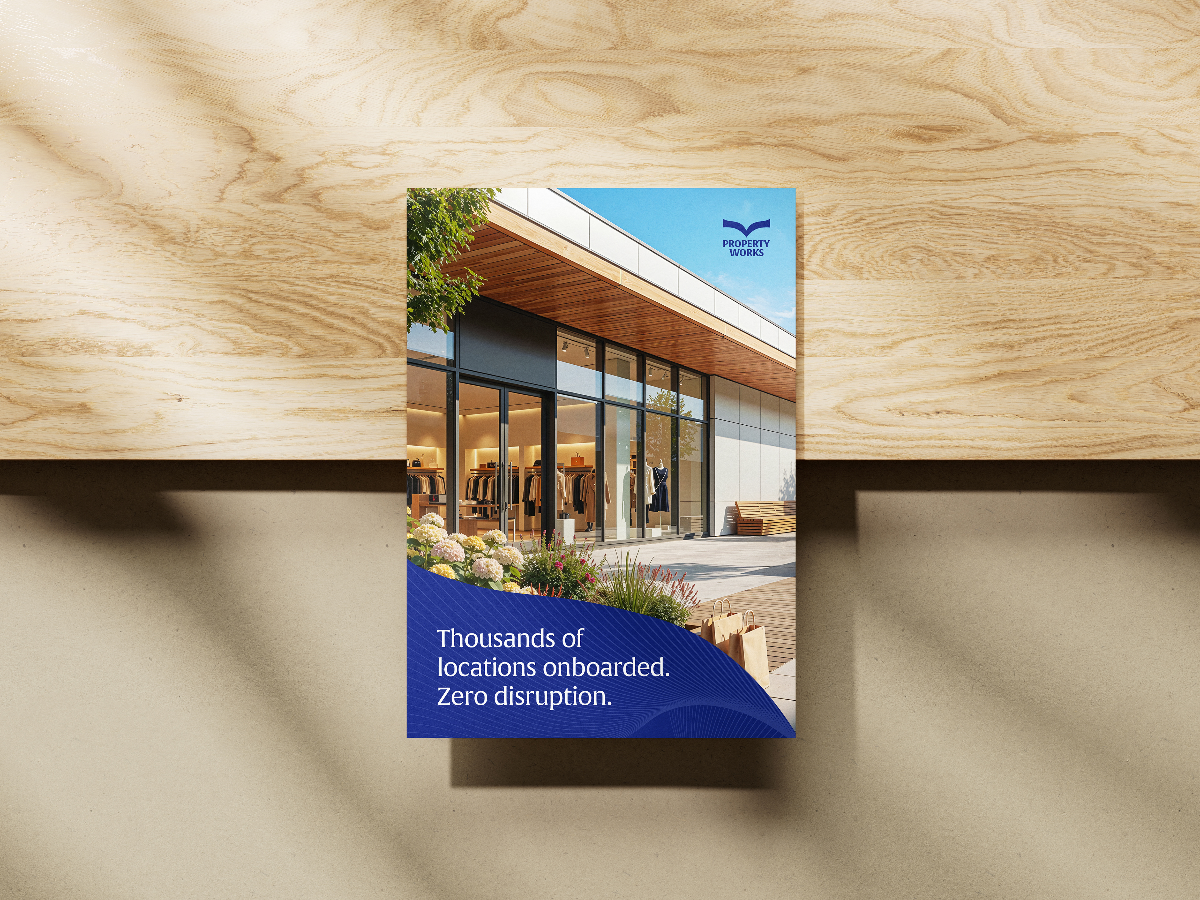
Key Visual


Credits
Client: Property Works
Marketing & Brand Strategist: Tihannie Leo
Design Consultant / Brand Designer: Sherlan Gittens
GrowthPad Team:
Web Solutions Manager: Derick Carlson
Solutions Architect: Tyler Walsh
Agency: GrowthPad