
Creating a distinctive anniversary identity within a global brand system
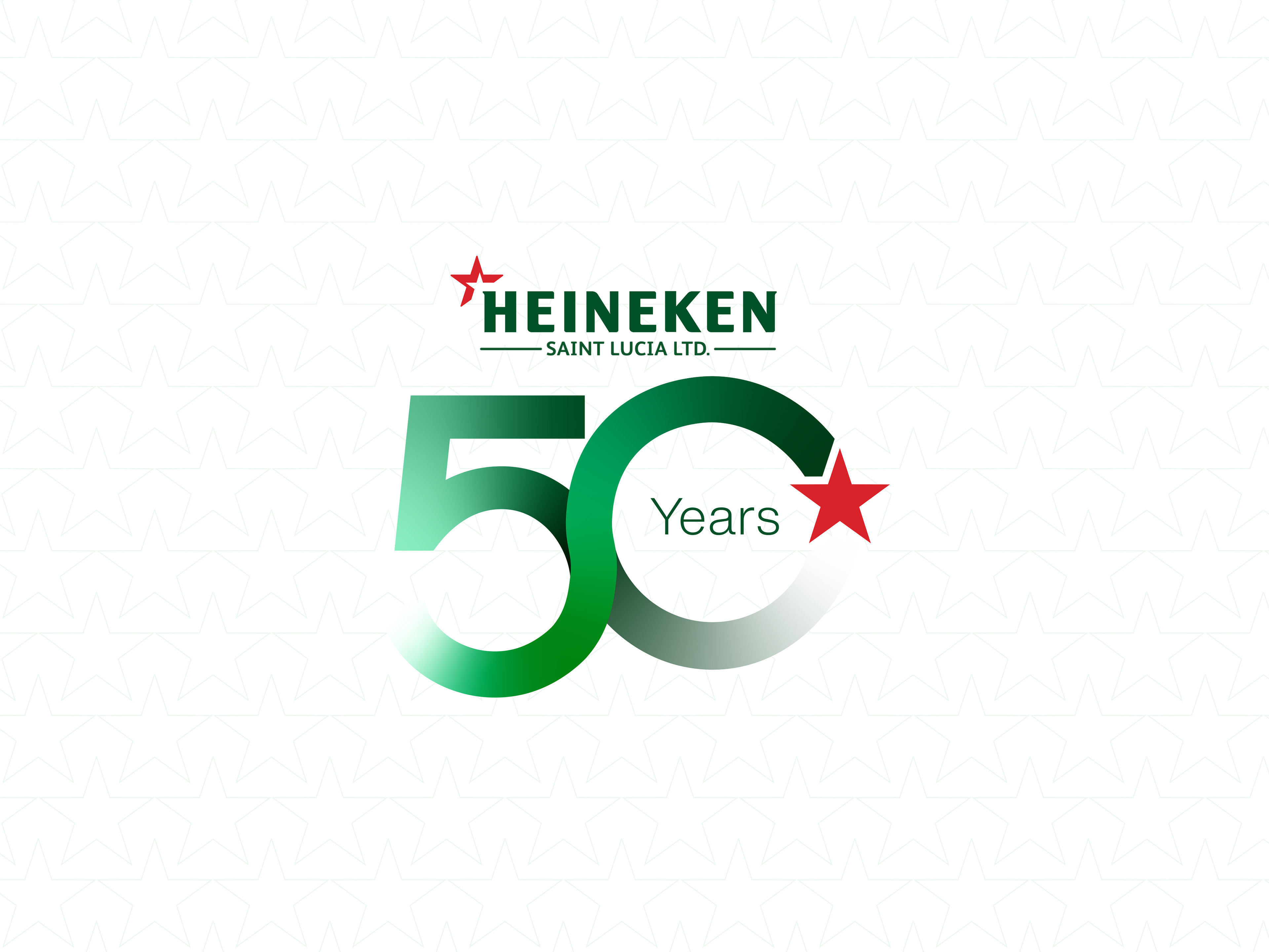
In 2025, Heineken Saint Lucia celebrated 50 years in the market. Through Boost Marketing, I was brought in as Brand Designer to develop the commemorative identity and selected campaign materials for the anniversary. The challenge was straightforward but demanding: make 50 years feel significant while ensuring the identity remained unmistakably Heineken.
Rather than treating the anniversary as an opportunity to create a completely new visual language, I first studied how Heineken had extended its global identity across previous campaigns and limited-edition marks. I looked closely at its use of the Star, typography, campaign identities and the relationship between these expressions and the core Heineken logo.
This research revealed more creative freedom within the system than I initially expected. It gave me the confidence to work with existing brand elements in a way that felt considered rather than restrictive.
A Mark Built Around Continuity
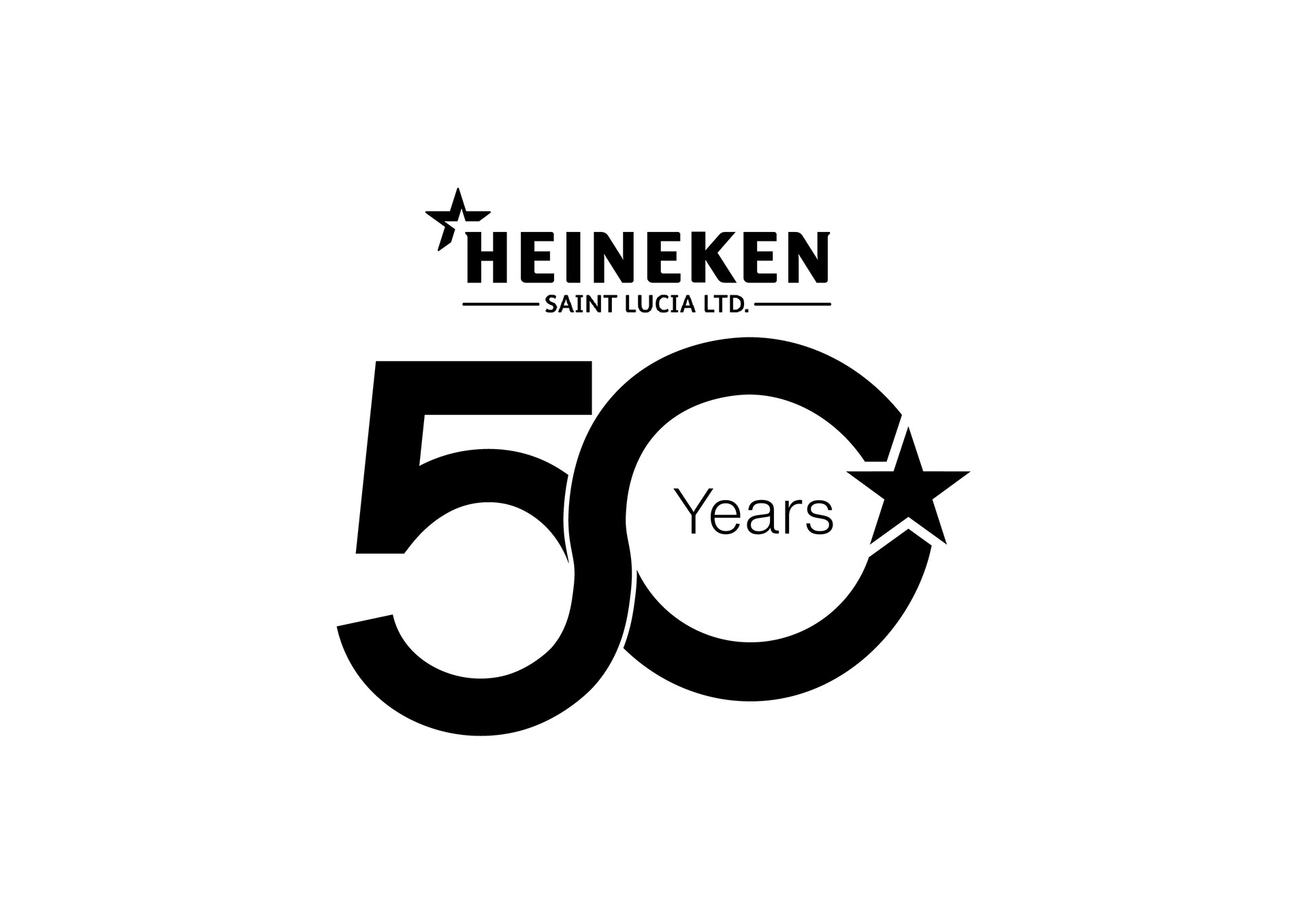
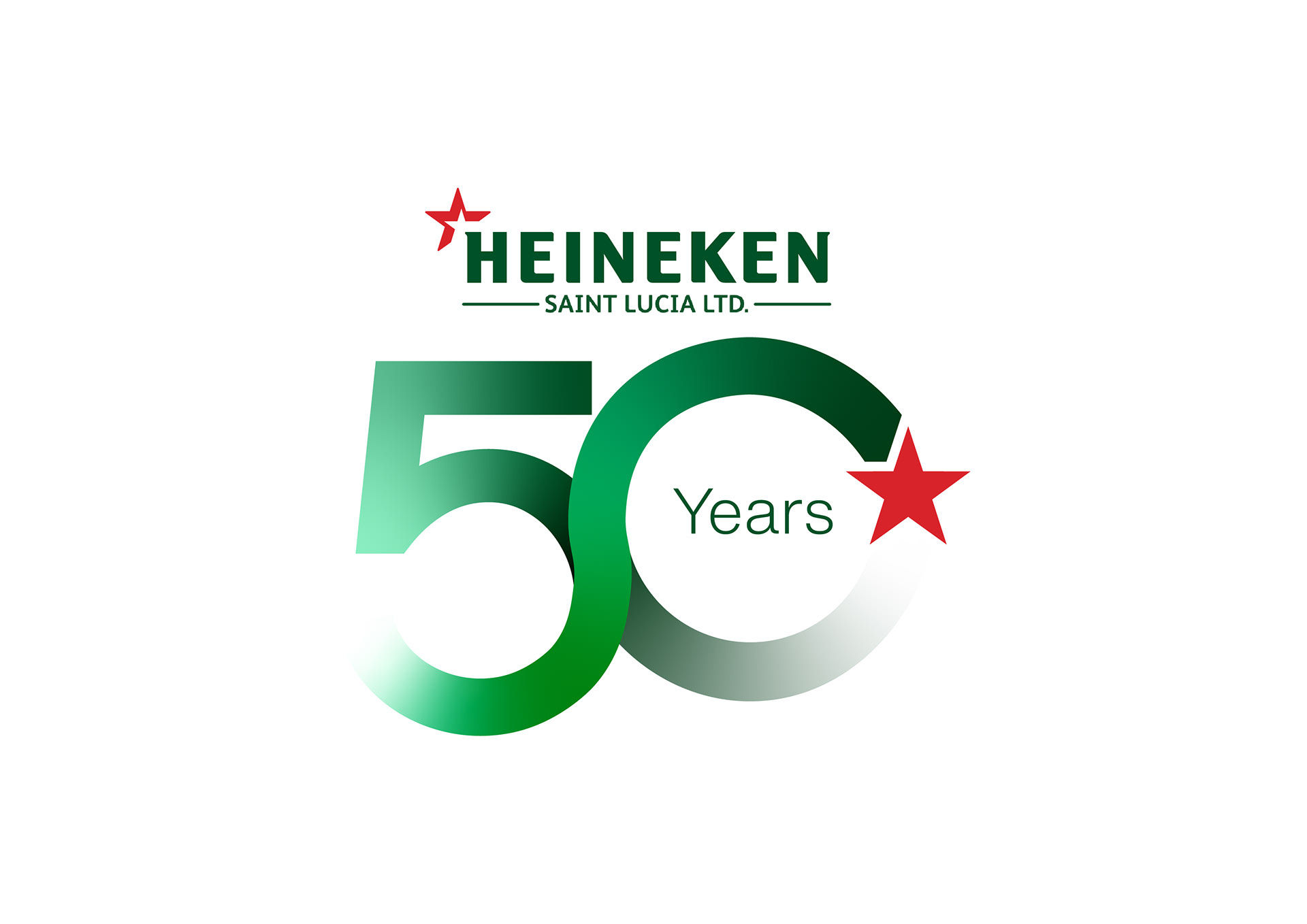
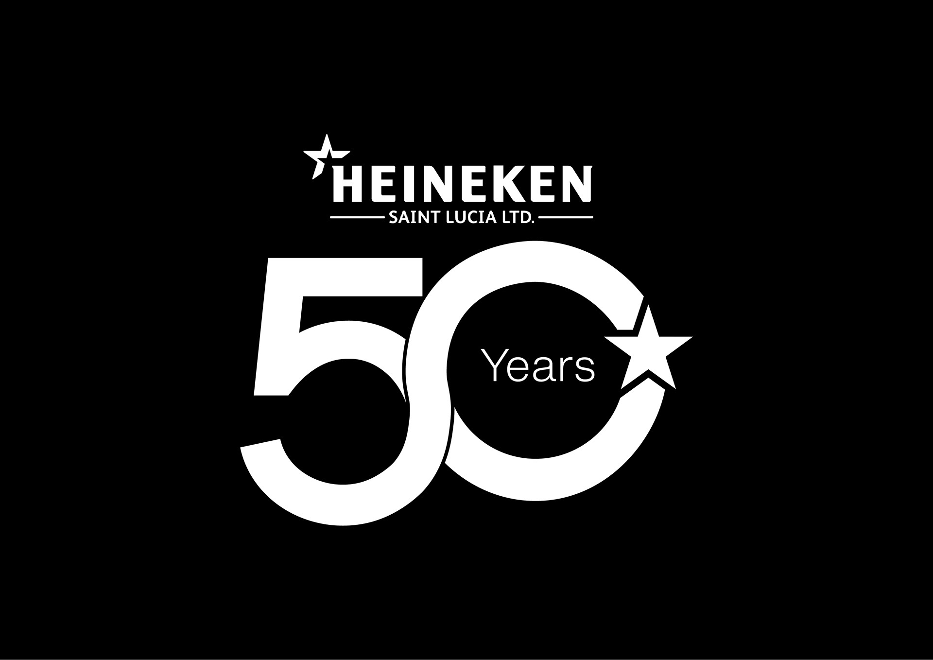
The anniversary logo centred on the idea of longevity and continuous achievement. The 5 and 0 were constructed as an uninterrupted flow, representing 50 years of continued presence and achievement. The Heineken Star became a central anchor within the mark—not only reinforcing the brand connection, but also acting as a familiar symbol of achievement.
The result was deliberately not a “Saint Lucian version” of Heineken. The local connection came through the occasion and its application. The identity itself needed to feel as though it belonged naturally within Heineken's global visual world.
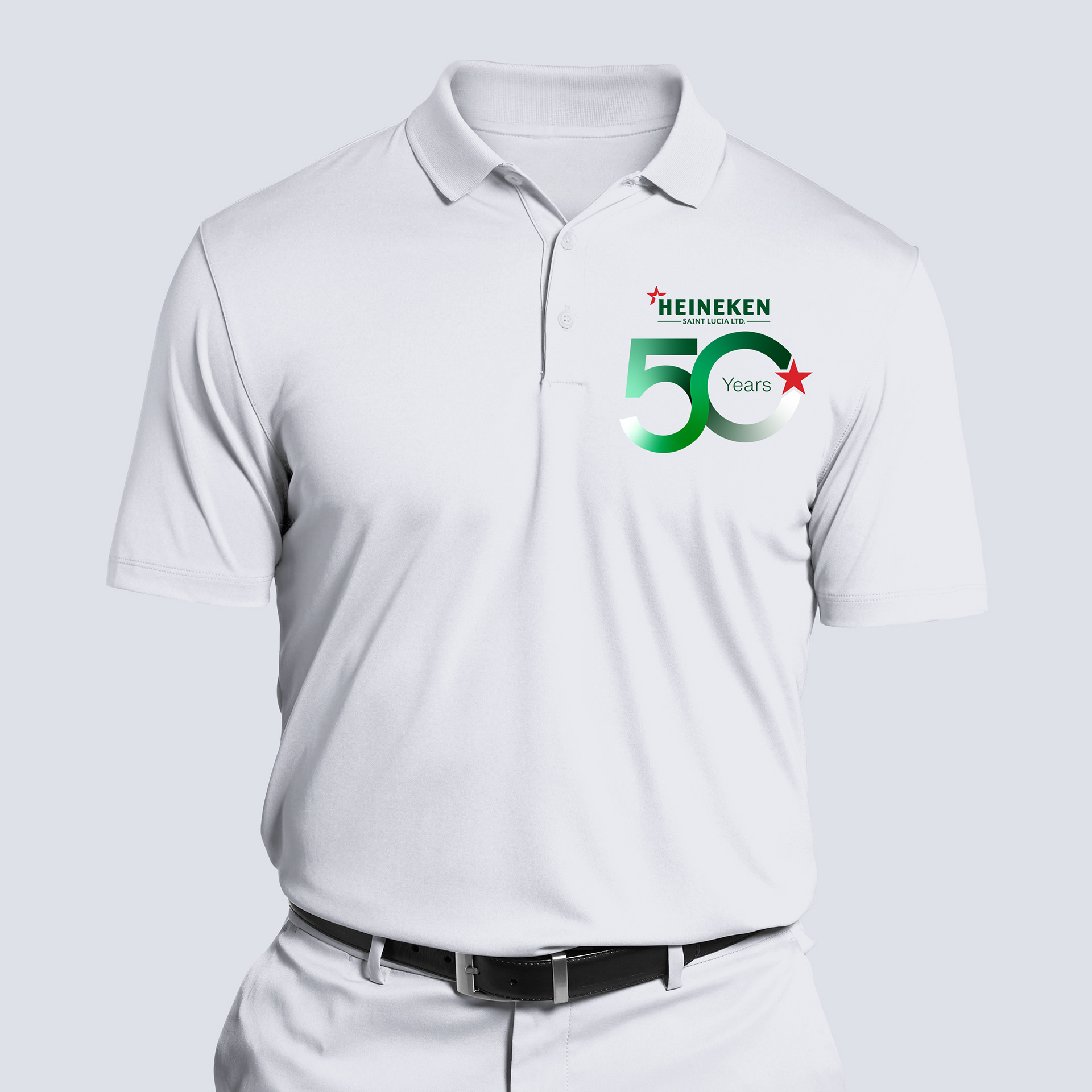
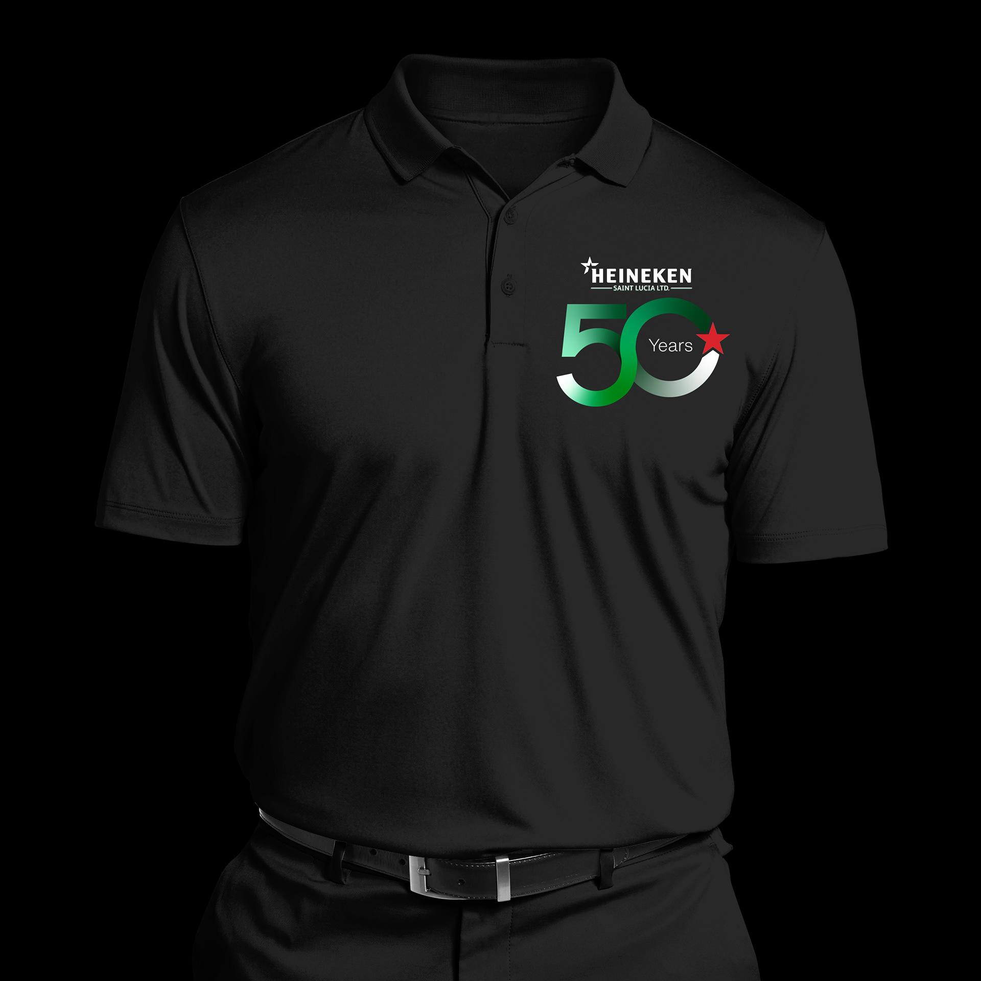
Extending the Identity
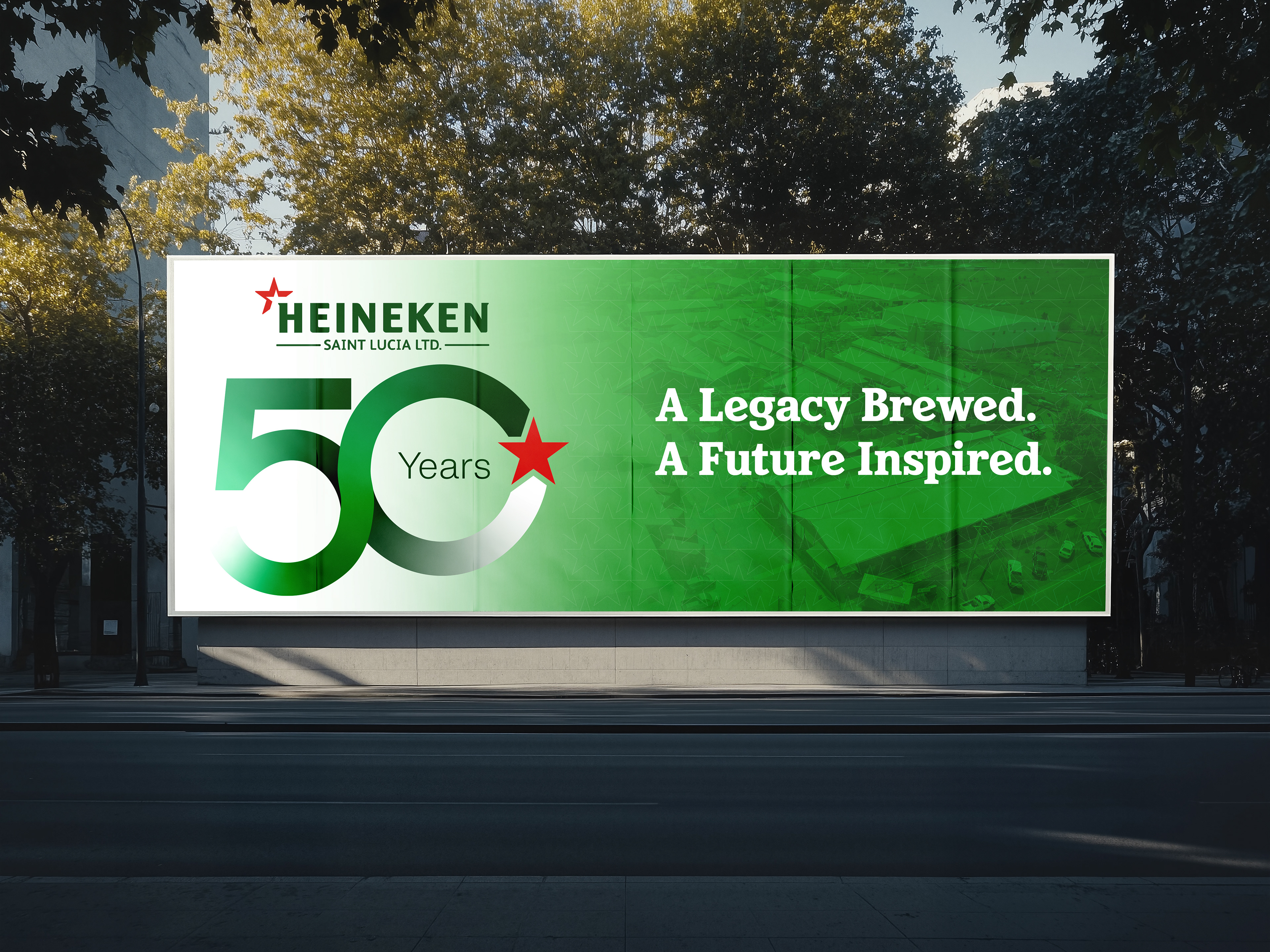
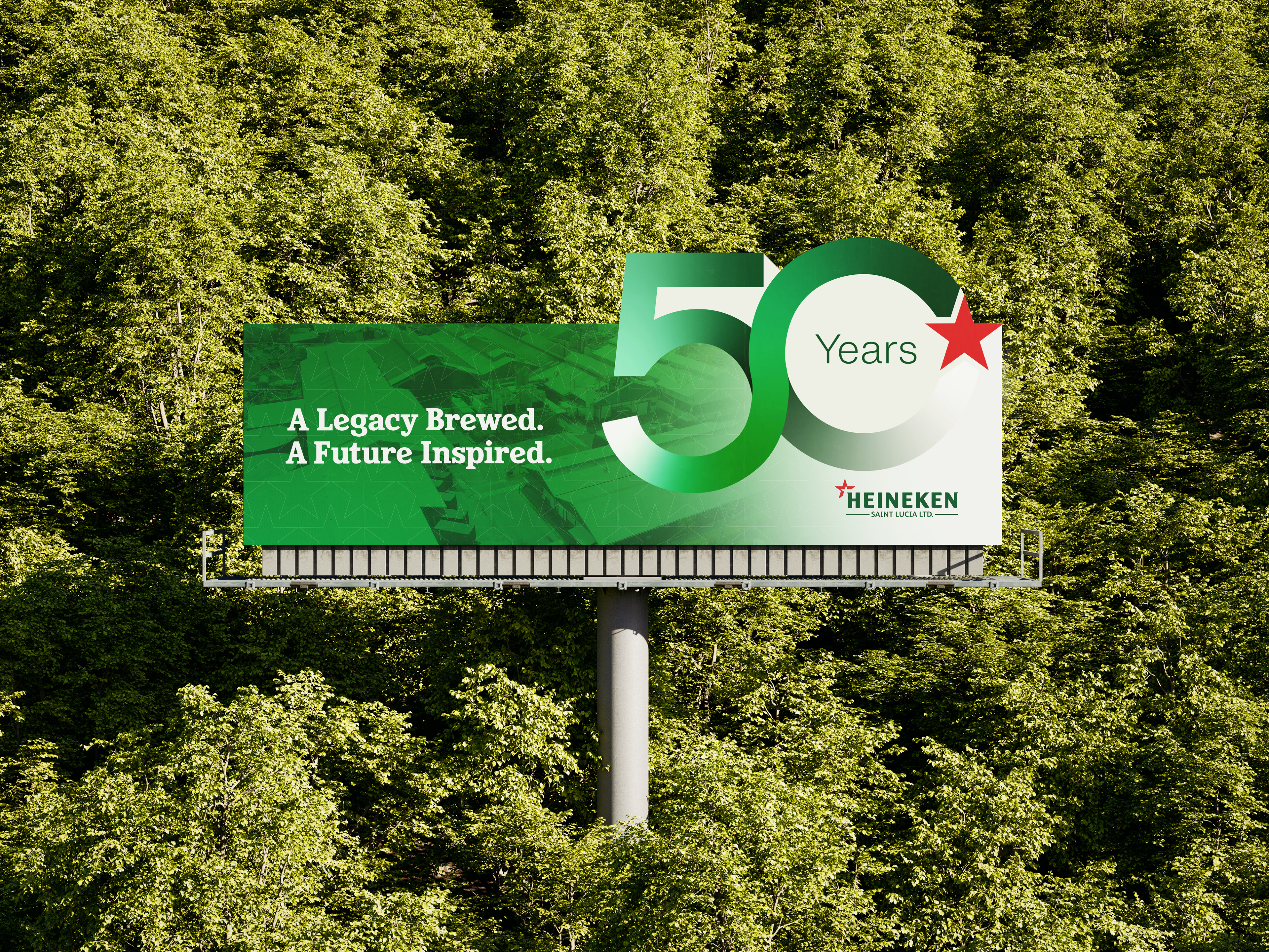
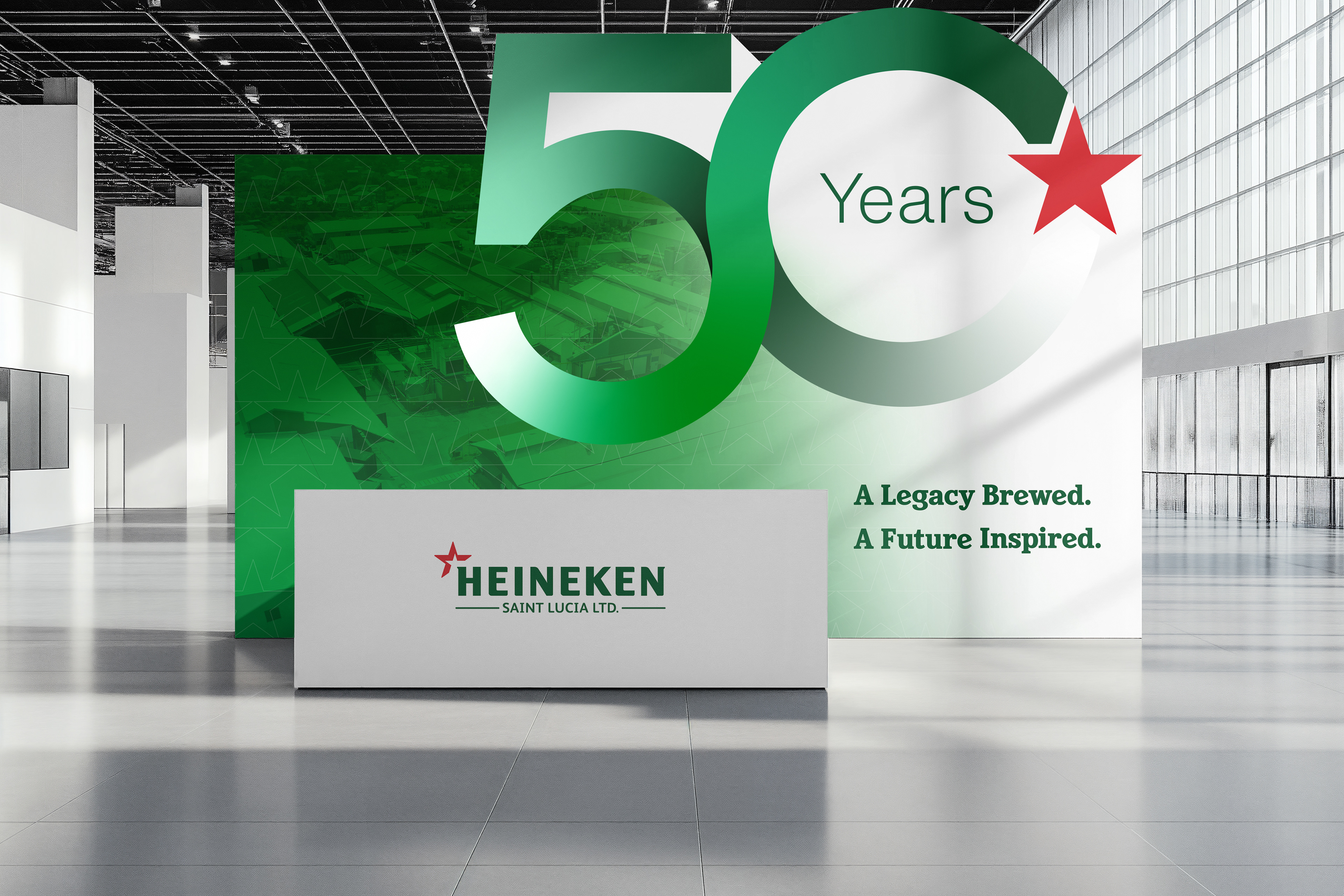
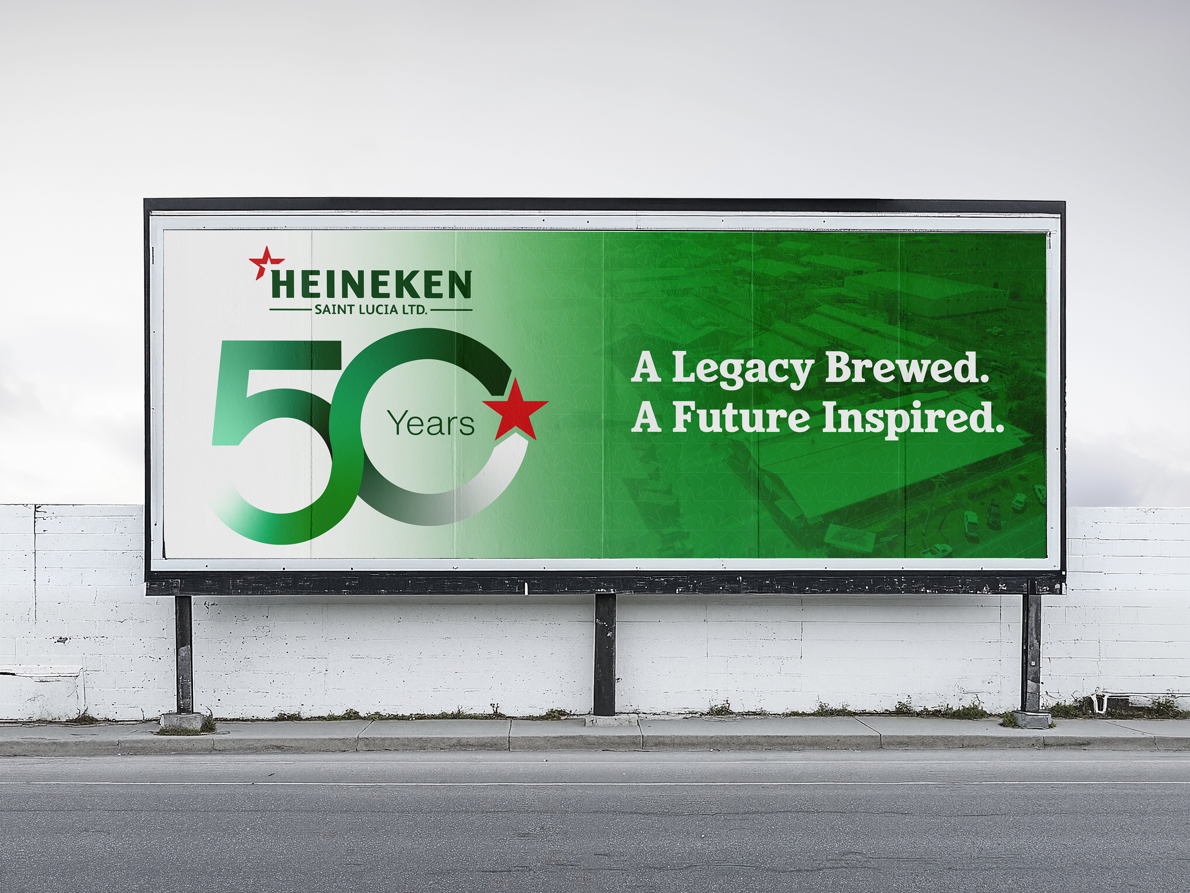
My involvement covered the anniversary identity, billboards and T-shirts, with additional guidance to the Boost team on selected social applications. Boost led the broader campaign rollout across billboards, bars, uniforms, signage, merchandise, social and other touch points. The campaign ultimately supported a year of anniversary activity across Saint Lucia.
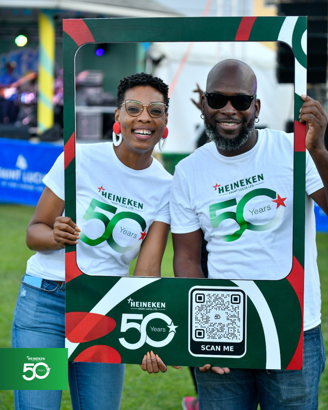
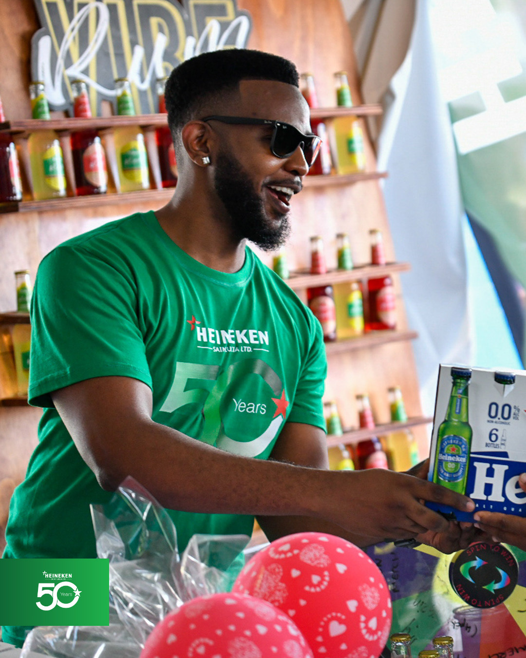
Reflection: Working Within the System
The project reinforced an important lesson for me: visual-system thinking isn't only about creating systems; it is also about understanding how to work within them.
When designing for a global brand, the challenge isn't necessarily to introduce something new. Sometimes it is to understand the existing system deeply enough to know where you can push it, and where you shouldn't.
Looking back, I would have asked more questions about the priority applications before finalising the identity. Understanding where the mark needed to live would have allowed me to anticipate more of the rollout and help maintain greater consistency across applications.
For Heineken's 50th anniversary, the goal was ultimately simple: create one strong visual expression capable of giving a year of celebrations a common identity, while remaining unmistakably Heineken.
Client: The Heineken Company (Saint Lucia)
Agency Partner: Boost Marketing
Creative Direction: Juelle Cadette
Art Direction & Design: Sherlan Gittens