
Background & Challenge
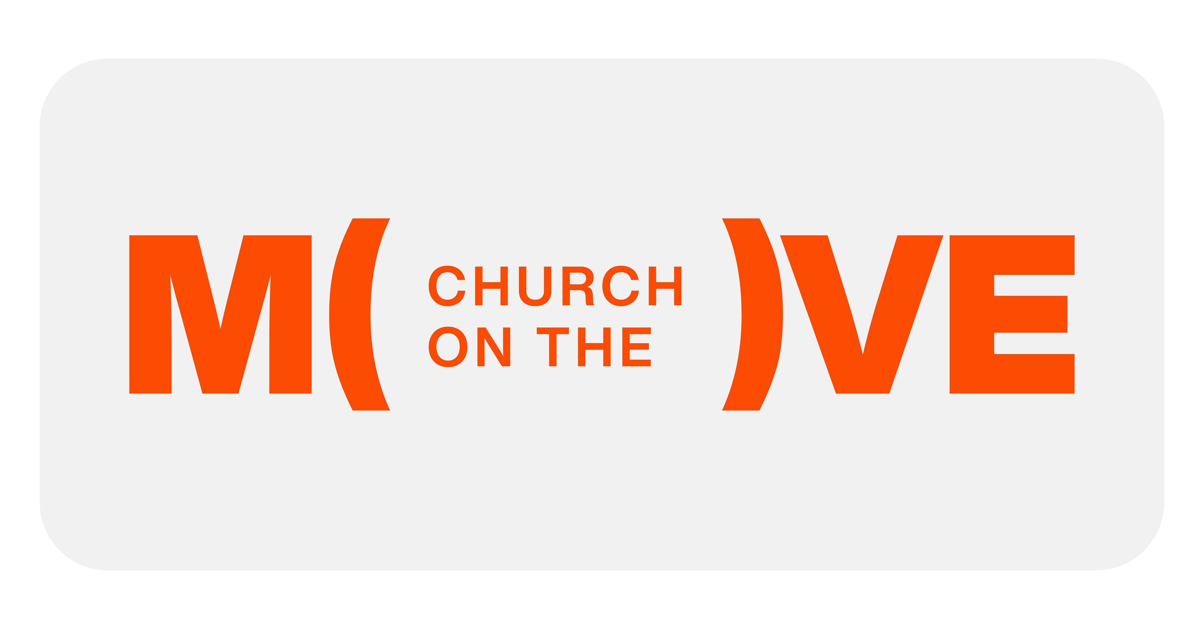
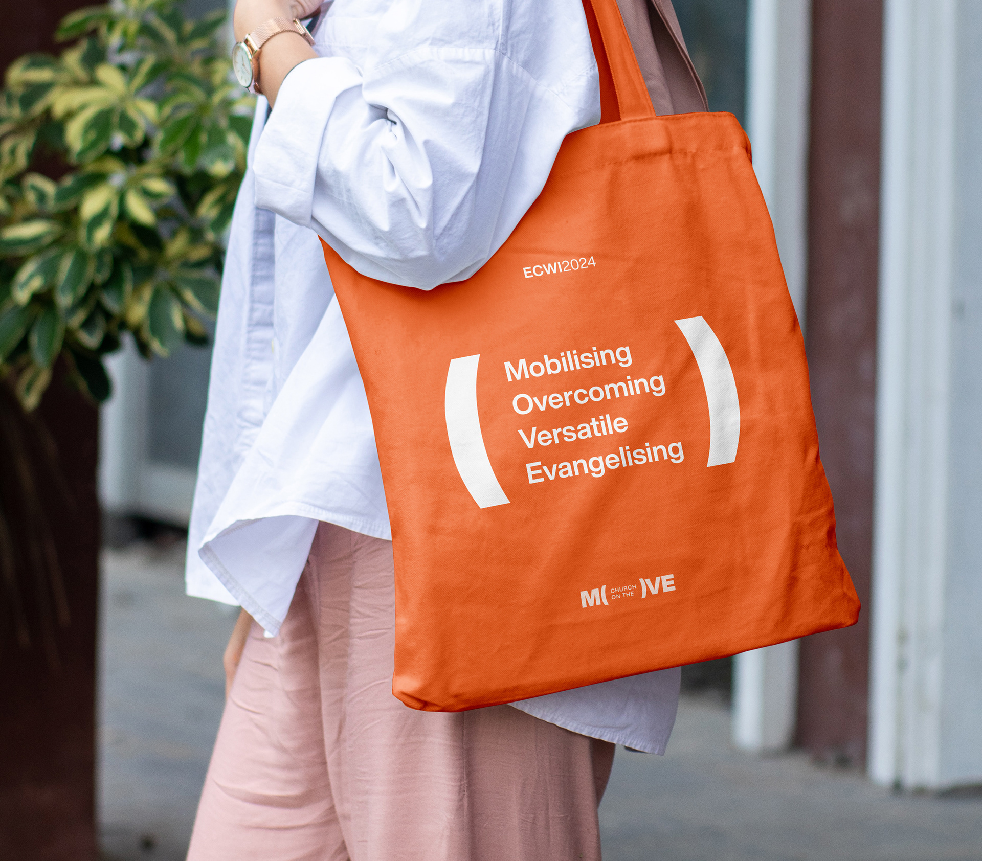
MOVE was ECWI's 2024 vision for its church community: Mobilising, Overcoming, Versatile and Evangelising. The mandate was deliberately broad, touching everything from outreach and evangelism to resilience, adaptability and collective action. The challenge was to capture all of that in an identity that didn't simply communicate the vision, but made the wider community feel that MOVE belonged to them.
The first challenge was finding a visual language that could speak to a remarkably diverse audience. Ideas that might immediately resonate with younger members could easily become confusing or inaccessible to an older generation. Custom typography, movement, symbols and iconography were explored, but the more complex the ideas became, the more difficult they were to interpret.
Solution
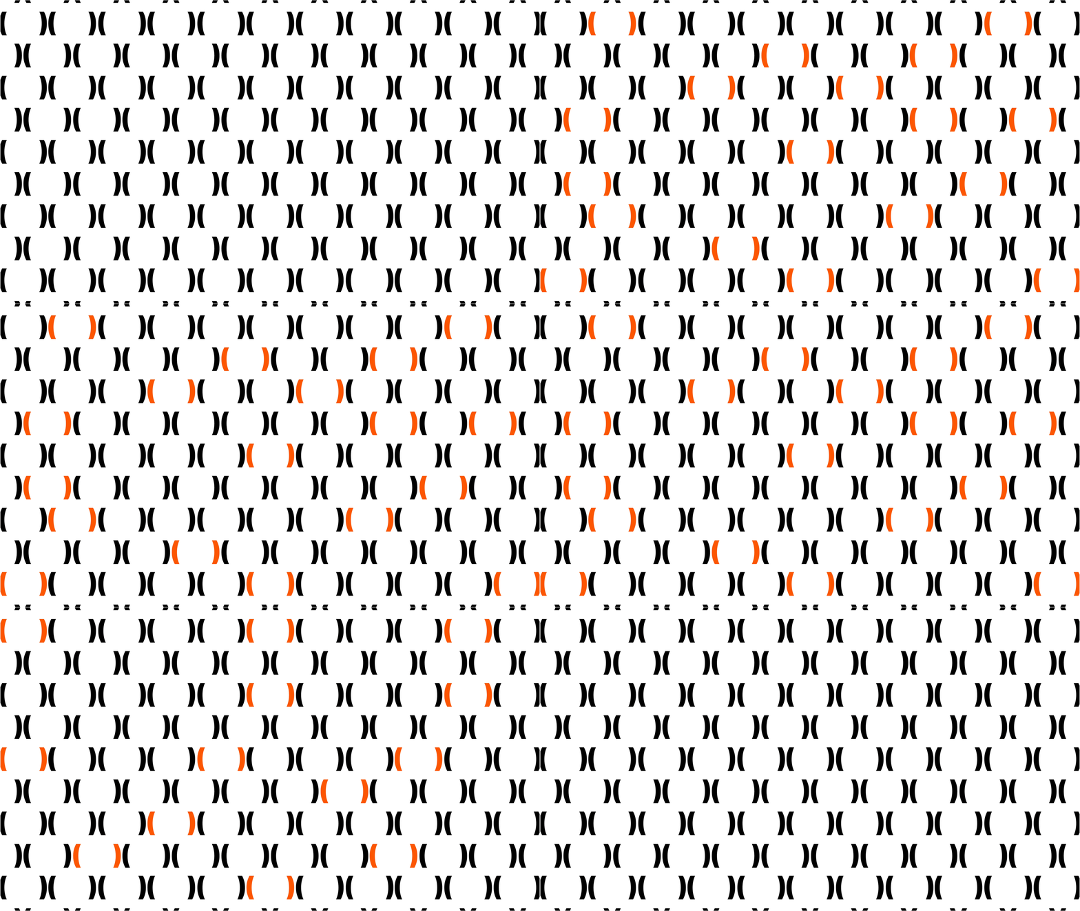
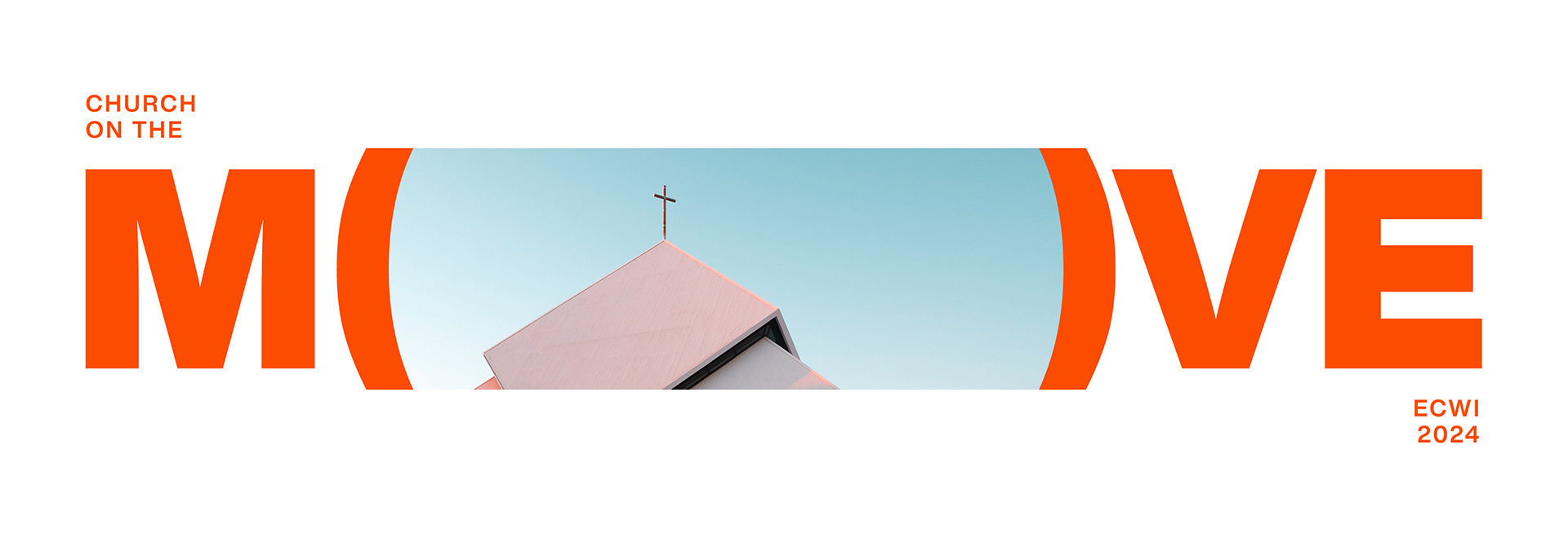
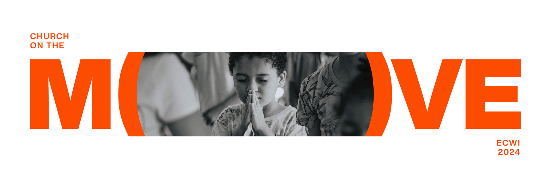
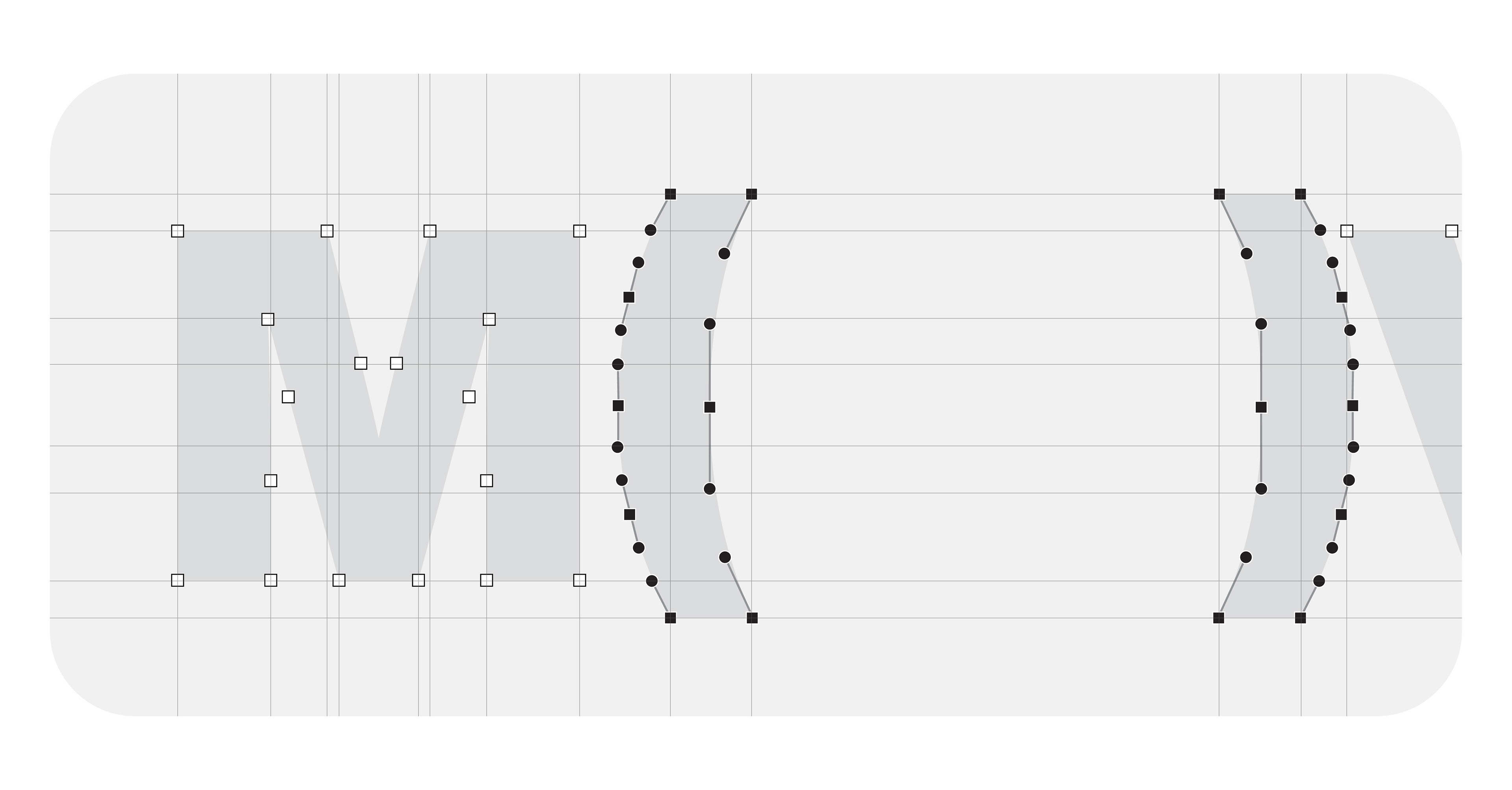
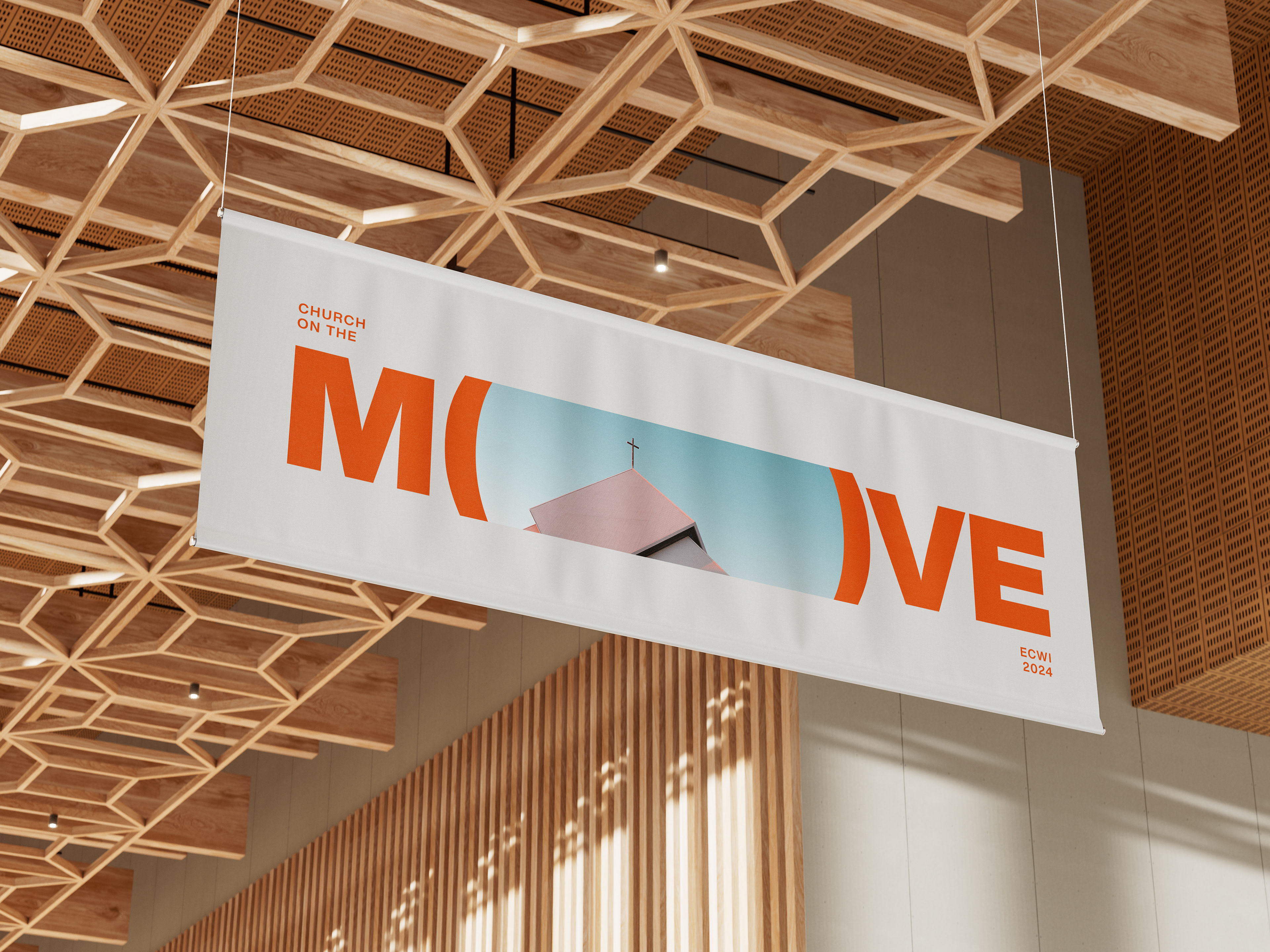
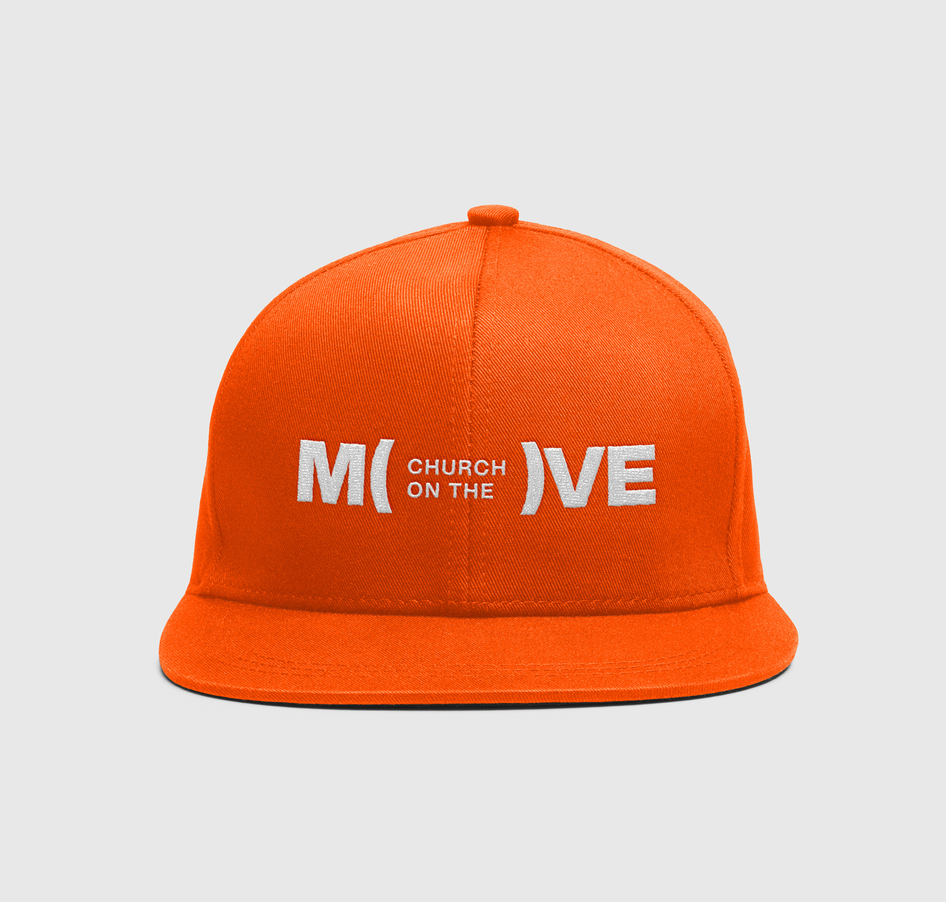
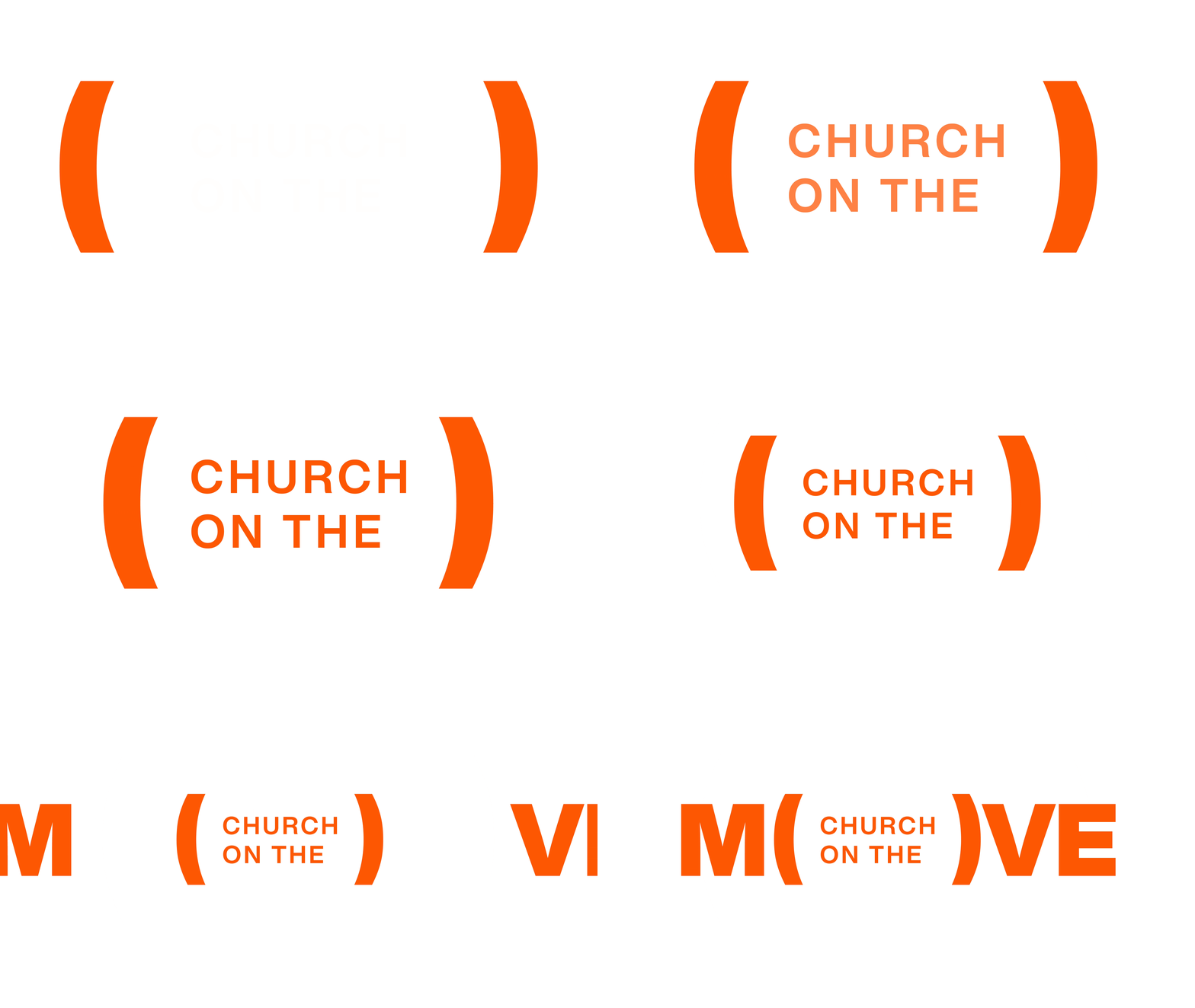
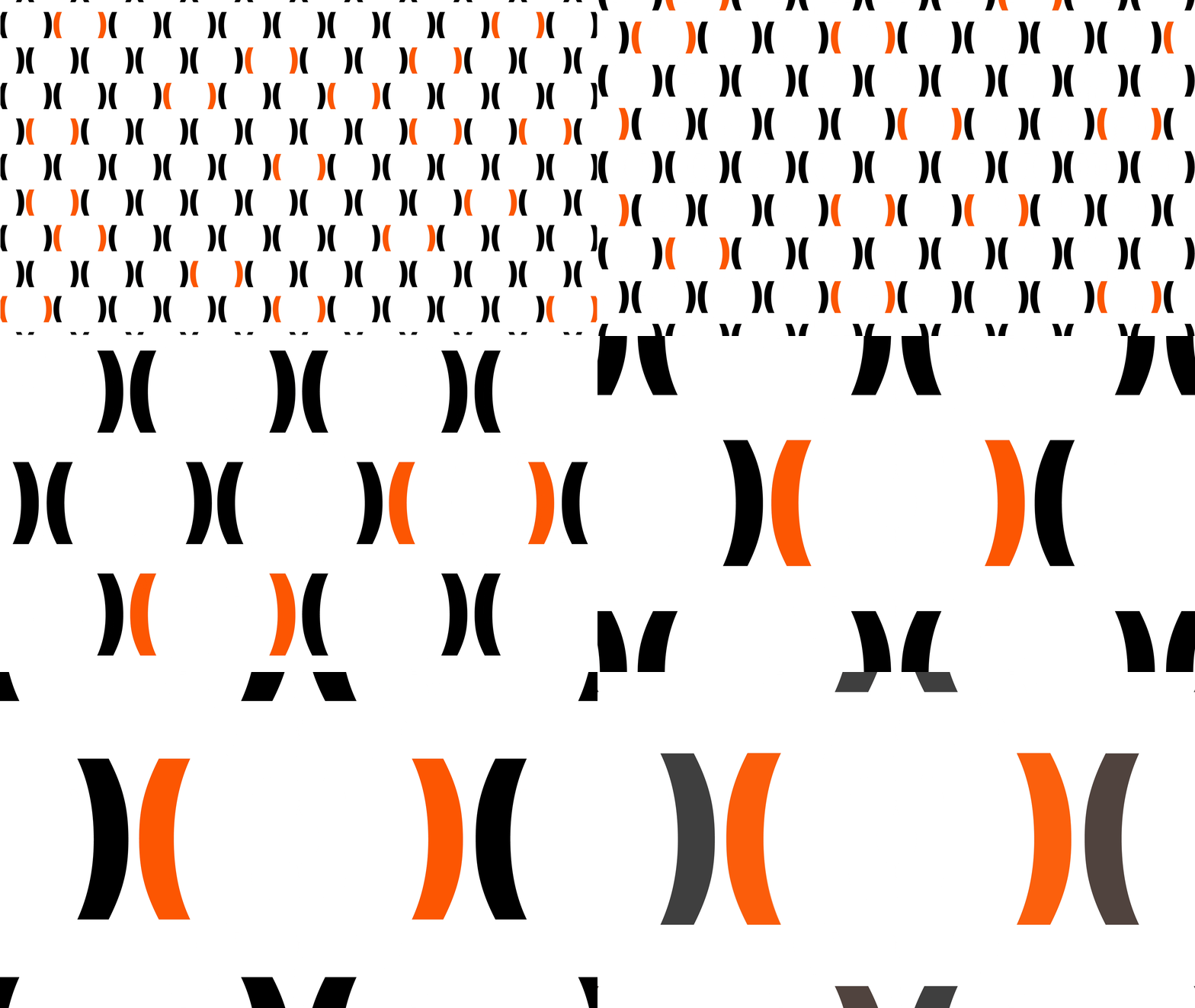
The question became: How can a design system capture every aspect of the theme through one simple visual idea? The answer was found in the brackets. The open and closed brackets create an immediate suggestion of an O—a simple gesture that could be understood without explanation. But their real value was what they could do beyond the logo.
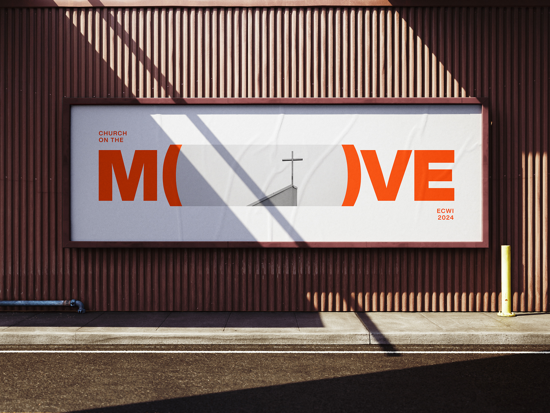
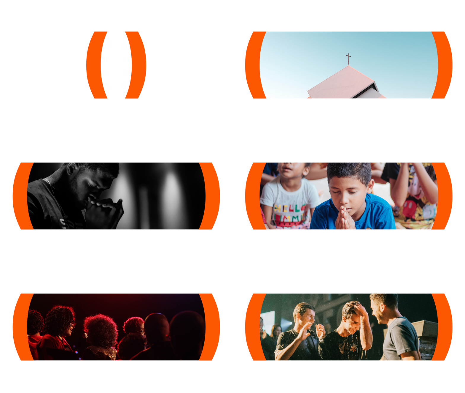
The brackets became a container: for photography, video, scripture, prayer and messages. Their simplicity gave the identity the flexibility to move between different expressions of the vision while remaining recognisably part of the same system.
The idea was tested beyond conventional campaign applications. One of the most successful was a prayer wall: A1 posters filled with empty brackets, inviting members across ECWI churches to place their prayers inside them using sticky notes. The identity stopped being something the church looked at and became something the community could participate in.
Implementation & Impact
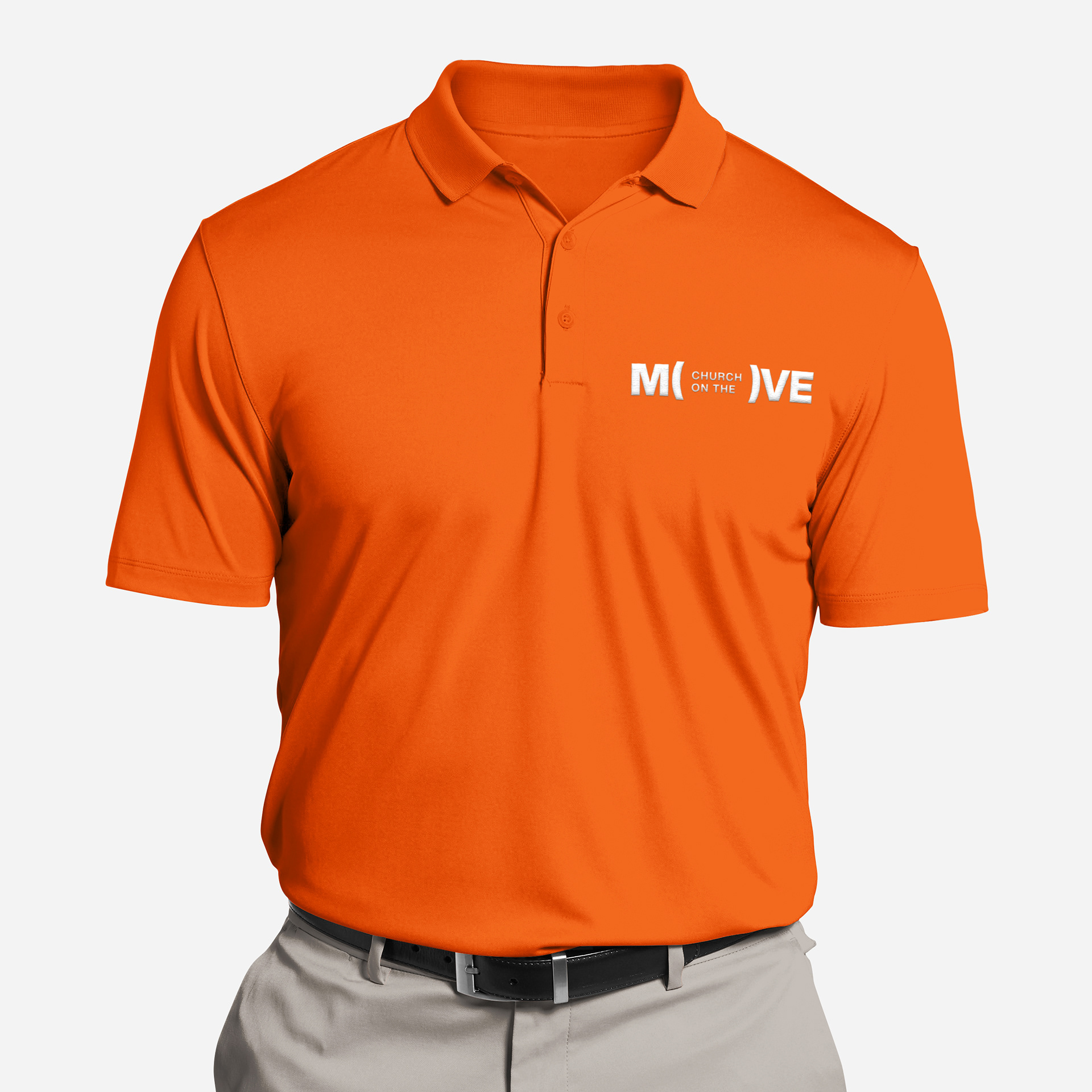
I led the creative direction and overall visual system, working directly with ECWI leadership across the identity, typography, colour, photography, campaign materials, motion, environmental applications and brand guidelines.
The result was a bold and recognisable visual language that unified the community around a shared vision. Its impact extended beyond the original brief—the campaign was ultimately carried forward into 2025. The simplest idea became the most expansive: a system that gave everyone a place to MOVE.

Reflection
Designing for a diverse community taught me that simplicity isn't the absence of ideas; it is the discipline of making an idea accessible without diminishing it.
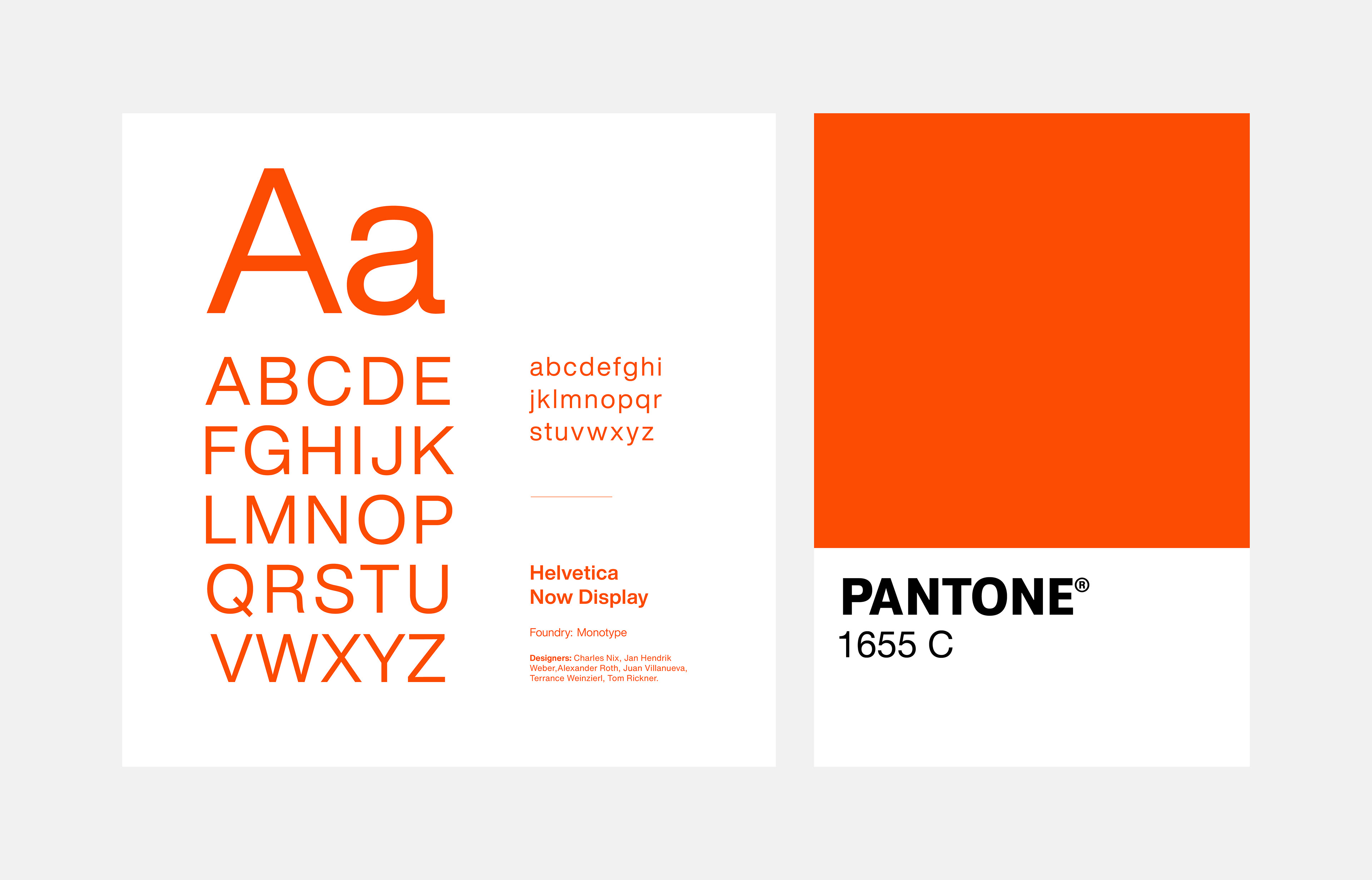
The project also challenged me to defend decisions that weren't immediately comfortable for everyone. The orange, for example, became a point of resistance during the presentation. Rather than retreating from the decision, I had to articulate why it belonged within the system and how it supported the character we were trying to establish.
But the more important turning point came from proposing something that hadn't been requested: the prayer wall. It demonstrated that the brackets weren't simply a graphic device, they could become a mechanism for participation. That shifted the conversation from whether people liked the identity to what the identity could enable the community to do.
That experience reinforced something I now bring into my work more broadly: the best design systems don't simply communicate an idea; they give people a way to participate in it. And when the audience is diverse, the simplest idea often has the greatest reach.
Client: Evangelical Churches of the West Indies (ECWI)
Scope: Brand Strategy · Creative Direction · Identity System · Campaign Design
Collaboration: Worked directly with ECWI leadership to develop and implement the campaign identity across church communications and community touchpoints.