
Bridging 30 Years of Experience with a Brand Built for What Comes Next
For more than 30 years, Property Works had built its reputation helping multi-location operators manage the complexity of their real-estate portfolios. What began as a real-estate advisory business had grown into a broader location-management company serving organisations with portfolios ranging from 20 to more than 2,000 locations.
Its clients were experienced operators managing some of the world's most recognisable franchise and multi-location brands. Many had trusted Property Works for more than a decade, but the visual identity didn't communicate that level of experience, authority and trust. The challenge wasn't to make Property Works look newer, it was to make the brand feel as credible as the company already was.
The problem wasn't a lack of brand equity, It was a lack of visual alignment with that equity.
The engagement initially began as a potential visual refresh. We explored directions, developed concepts and tested different visual approaches. Yet, something consistently failed to connect with management. We seemed to have everything a rebrand normally requires, but something was missing: the human element. So, we stepped back and began asking upper management: what is Property Works to you? The answers revealed something important. The leadership team consistently described a company defined by qualities such as trust, loyalty, confidence, authority, experience and consistency; yet those qualities were not being expressed by the existing identity.
The Strategic Direction: Reflect the company people already trusted.
Property Works' core audience consisted of seasoned professionals responsible for large franchise and multi-location portfolios—people for whom reliability, competence and consistency matter.
Therefore, our strategic objective was to Position Property Works as the mature, trusted authority its clients already experienced it to be. This also aligned with the company's broader story. Property Works describes its growth as being built through listening, solving and earning trust relationship by relationship, rather than through acquisition or consolidation. The rebrand needed to make that story visible.
The Visual System
Logo
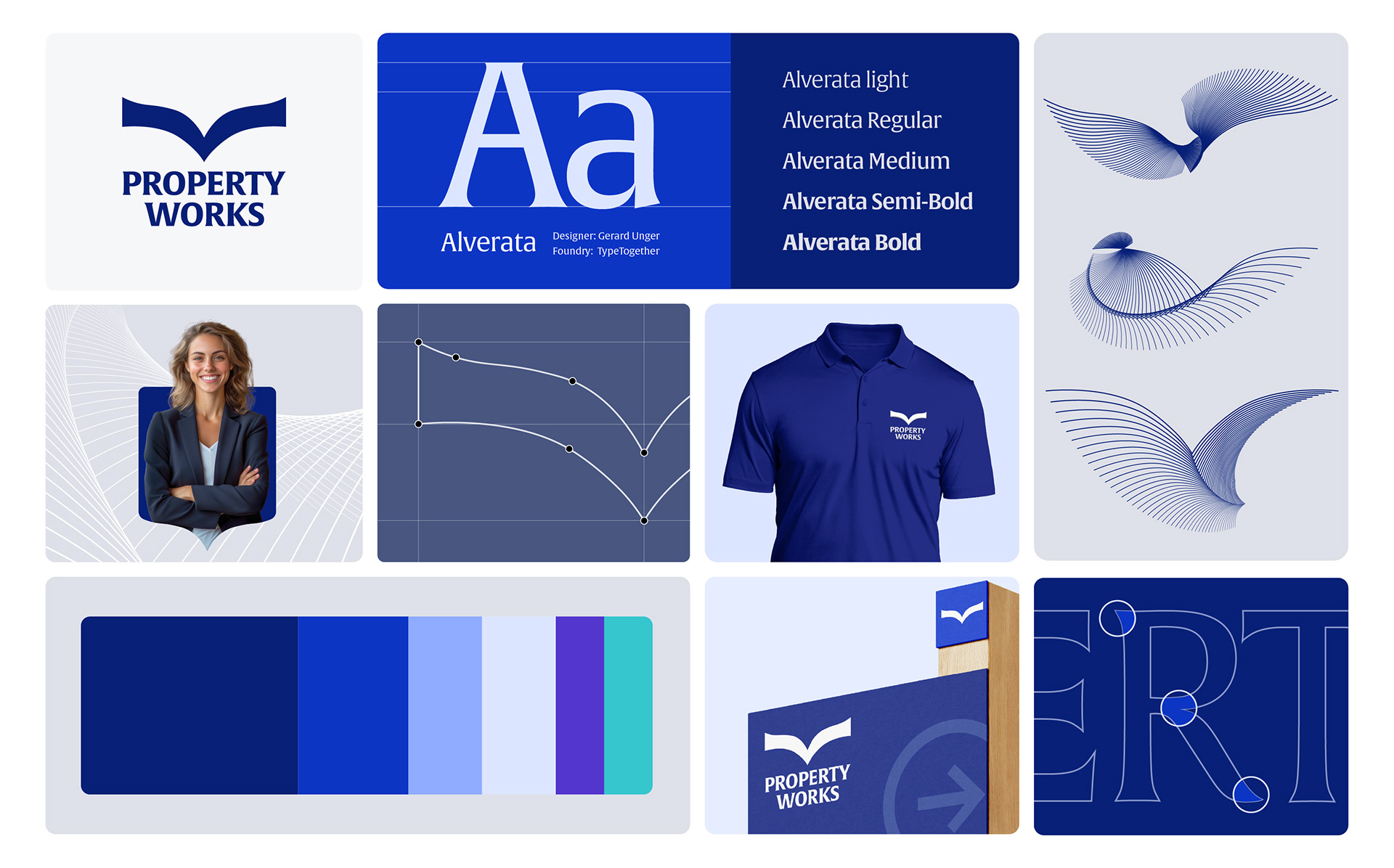
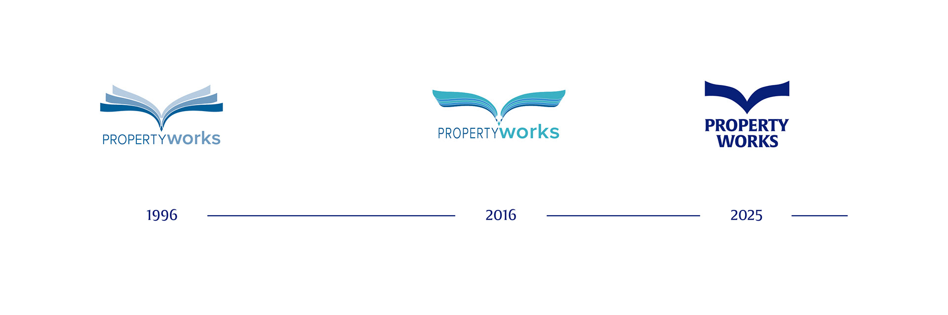
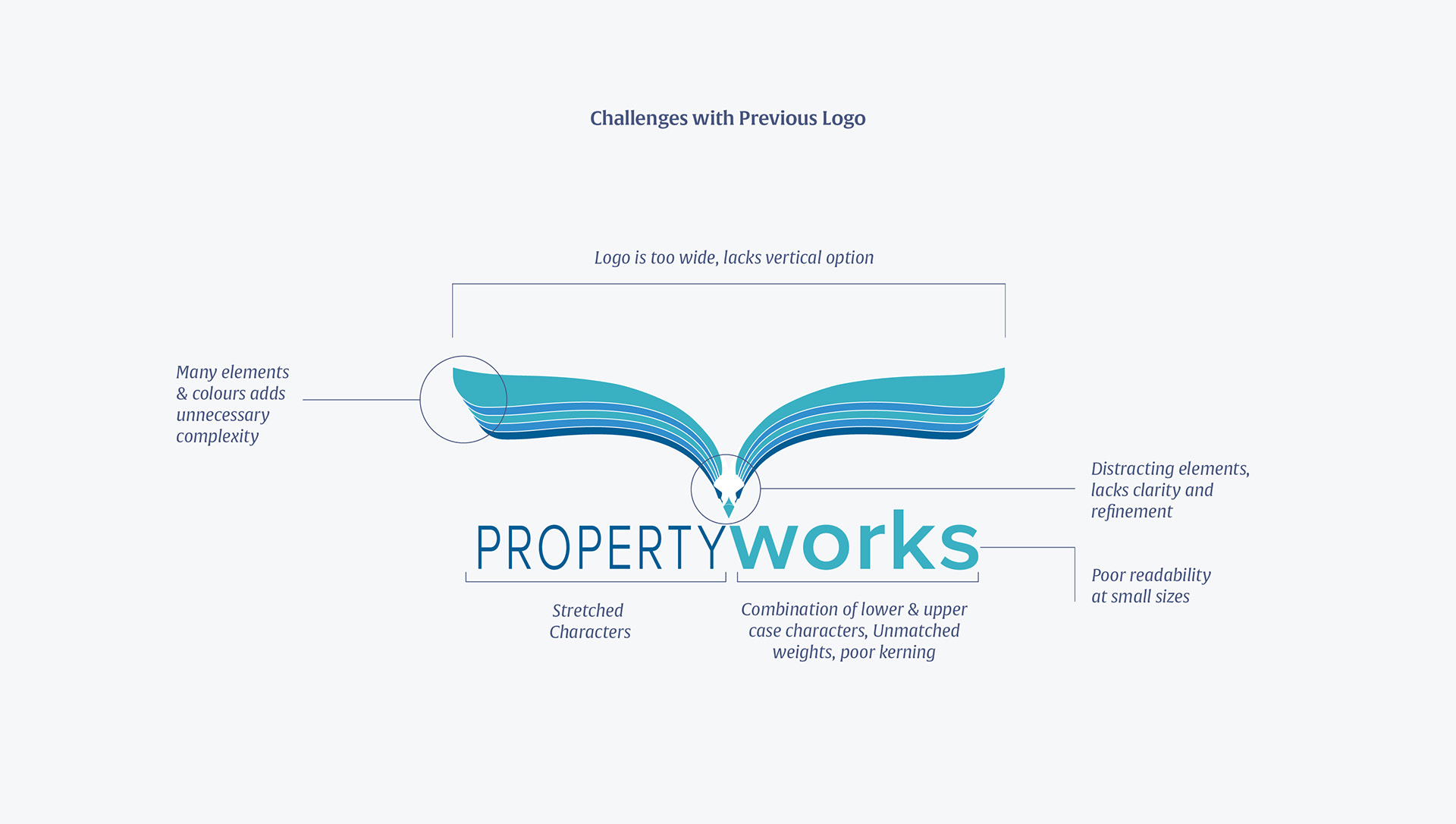
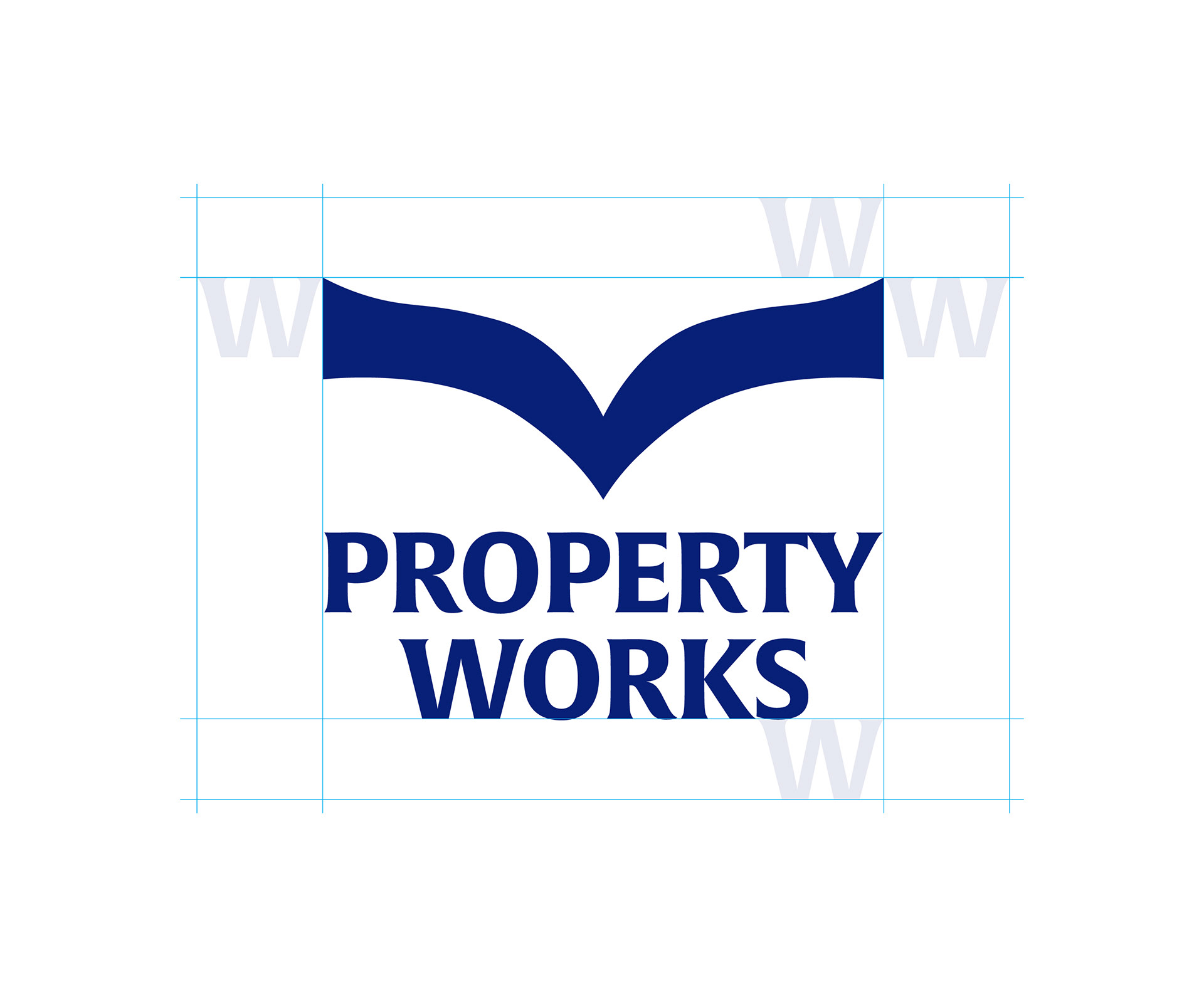
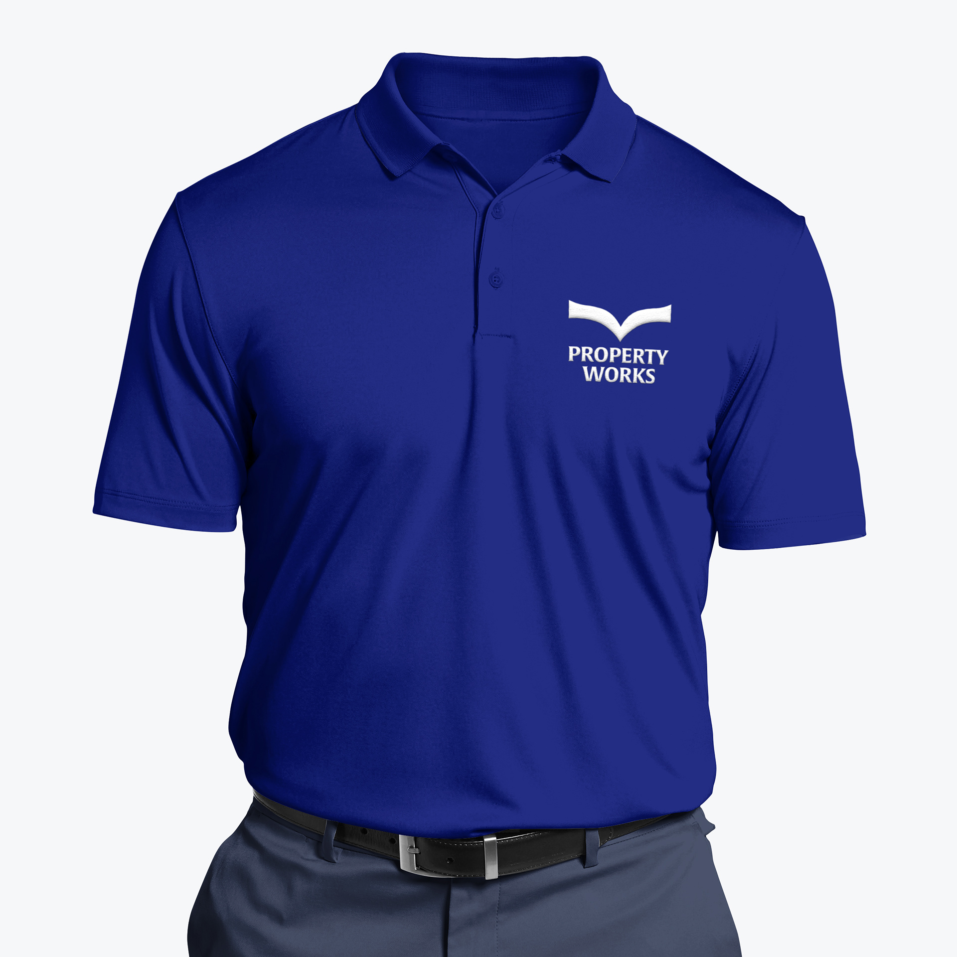
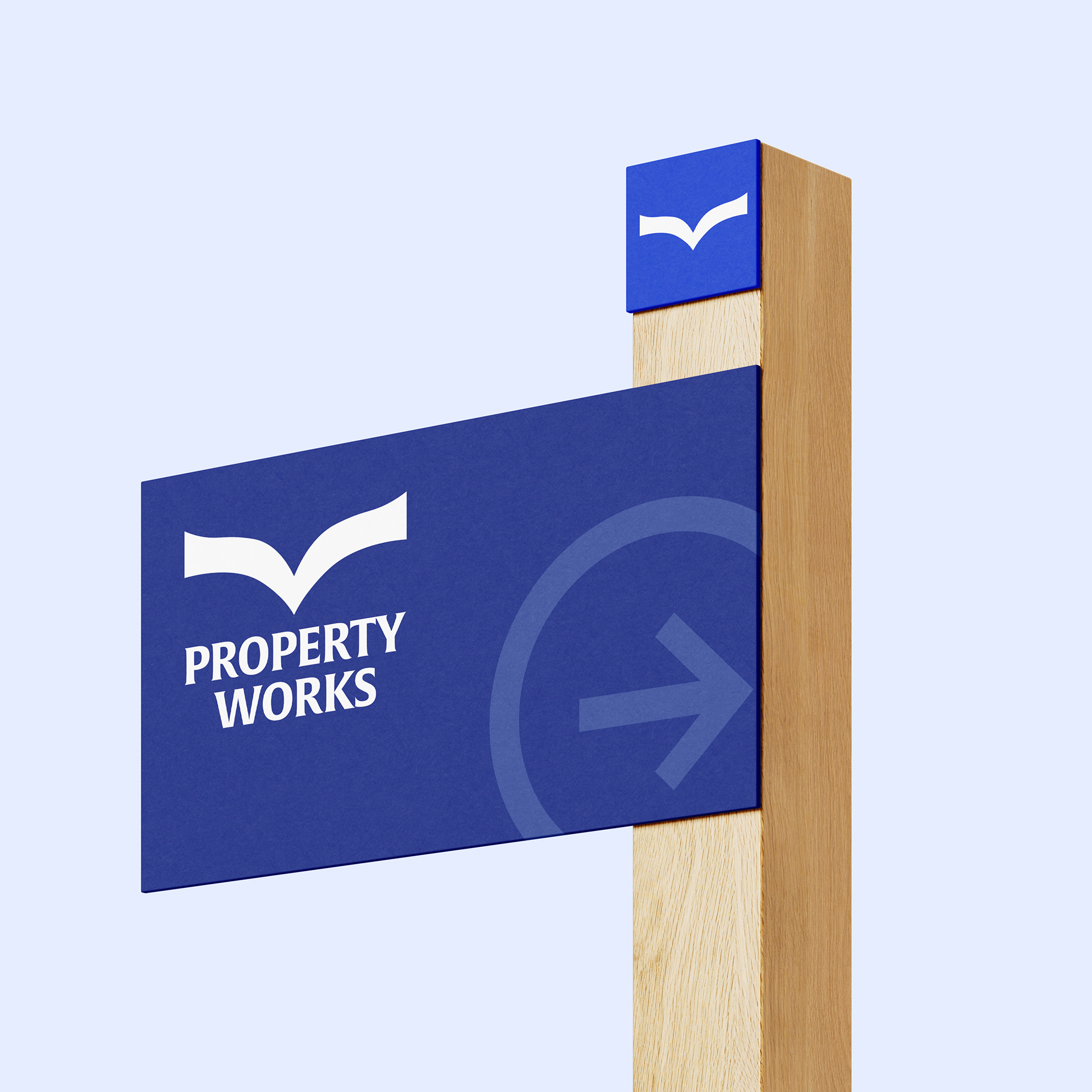
The logo's familiar shape had been part of Property Works' identity since its conception and had accumulated recognition among its audience. Replacing it completely would have discarded valuable equity in pursuit of novelty. Instead, we refined it. The goal was to preserve the recognisable character of the mark while bringing its execution and surrounding visual language into alignment with the organisation's maturity. This became a broader principle for the rebrand: Preserve what people recognise, transform what no longer represents them.
Typography
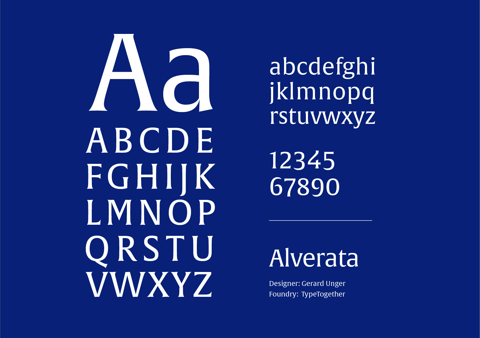
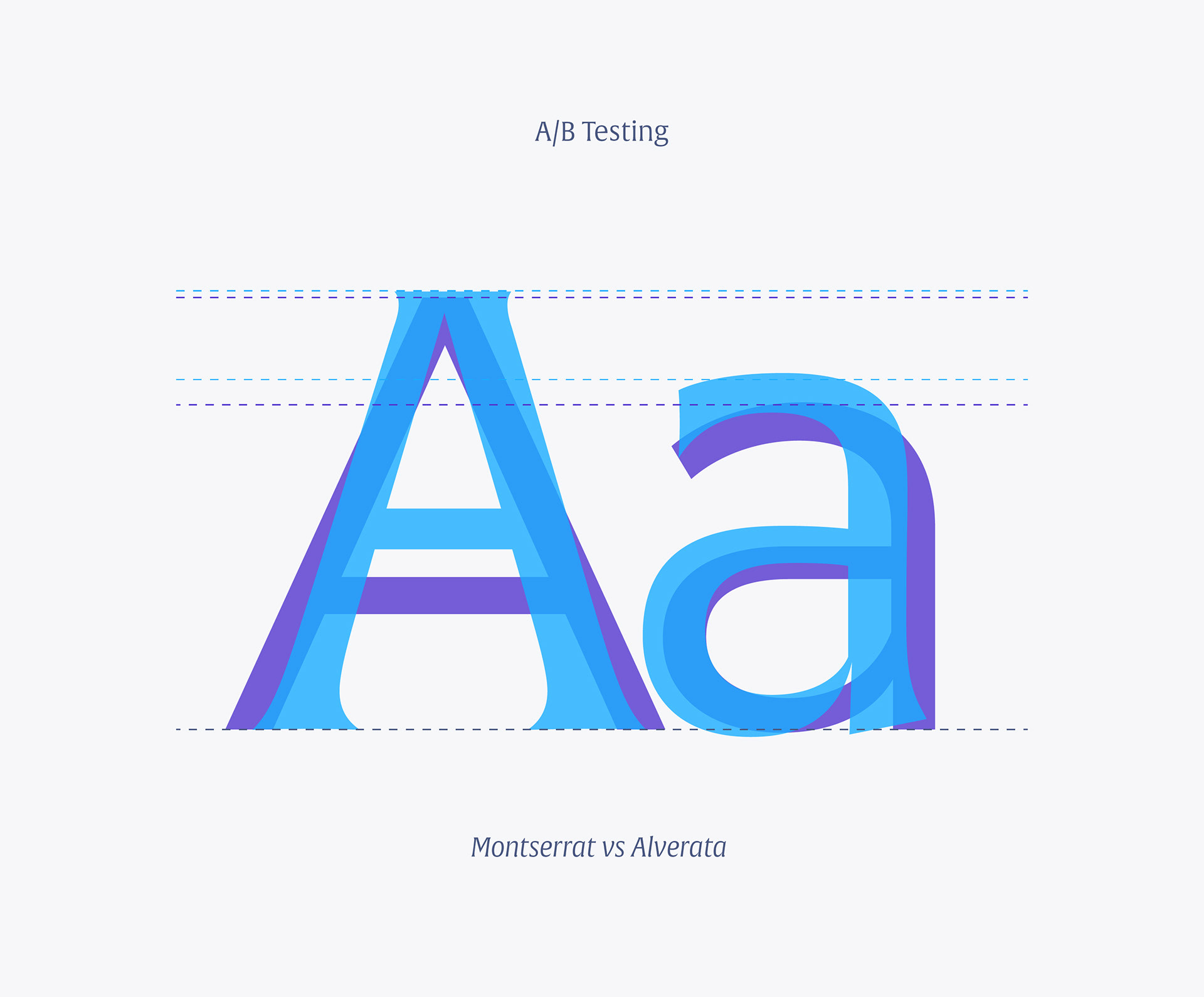
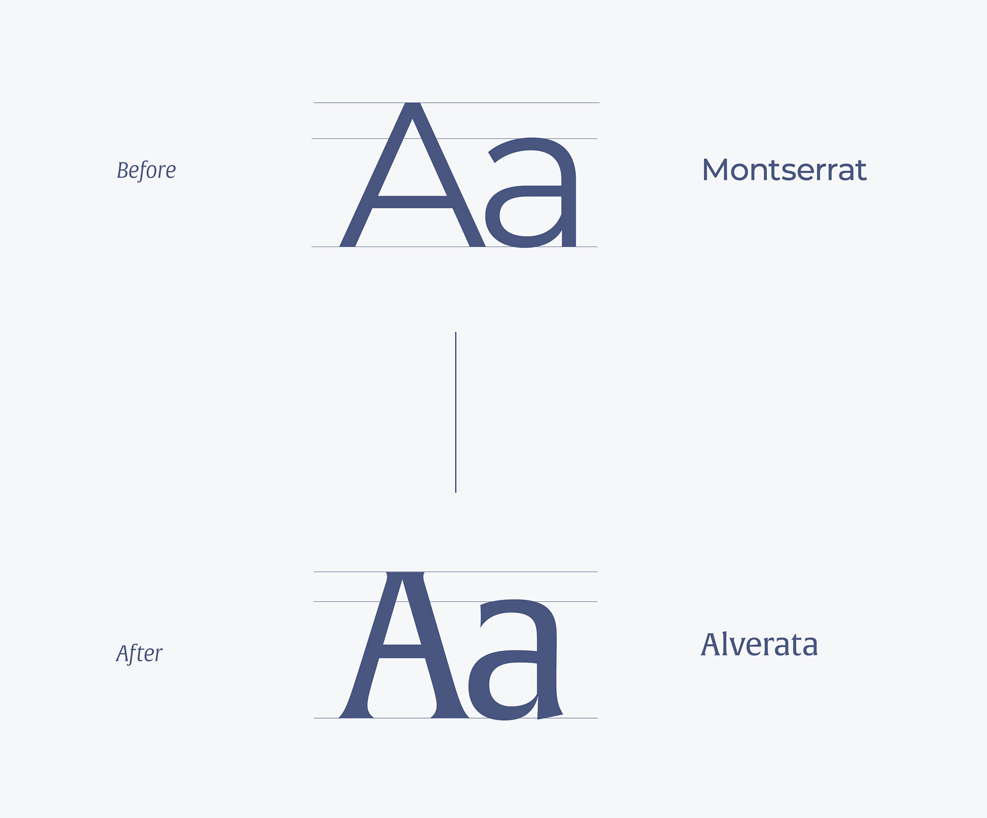
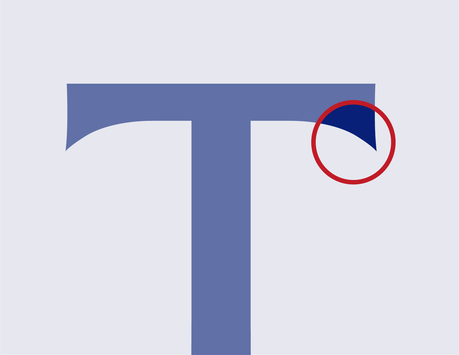
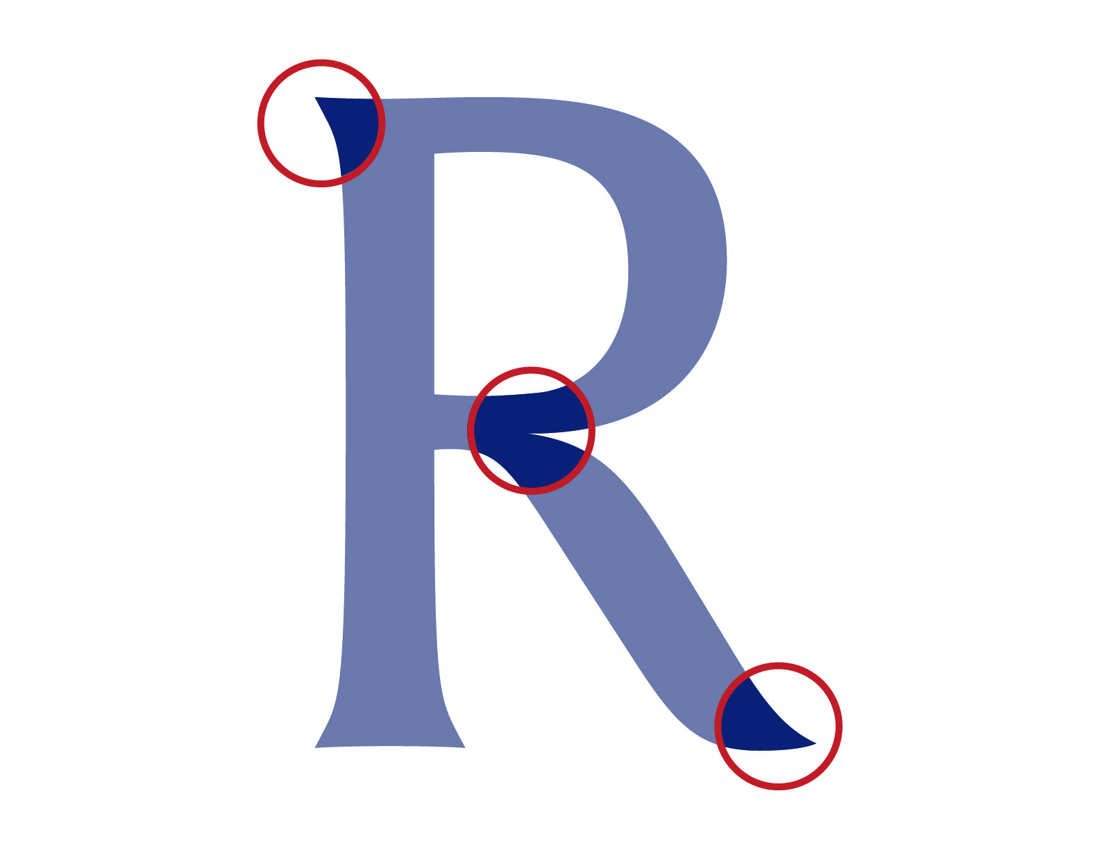
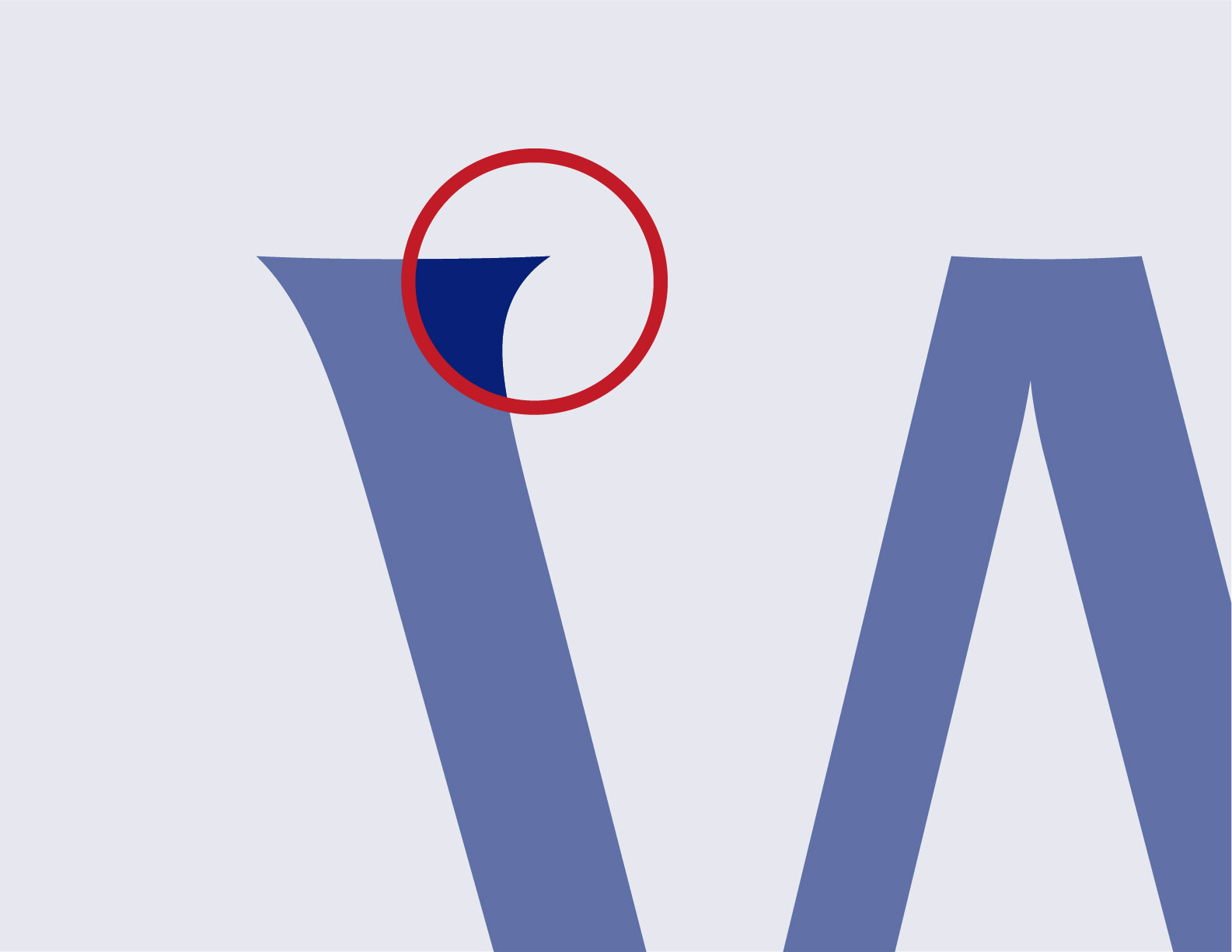
Typography became one of the primary tools for changing how the organisation was perceived. The typeface was selected not simply because it looked appropriate, but because its characteristics reinforced the nuances already present in the logo and supported the desired personality of the brand. The result was a more mature typographic voice; one capable of communicating authority without becoming distant, and professionalism without becoming generic. Typography became part of the brand's character rather than simply a functional choice.
Colour
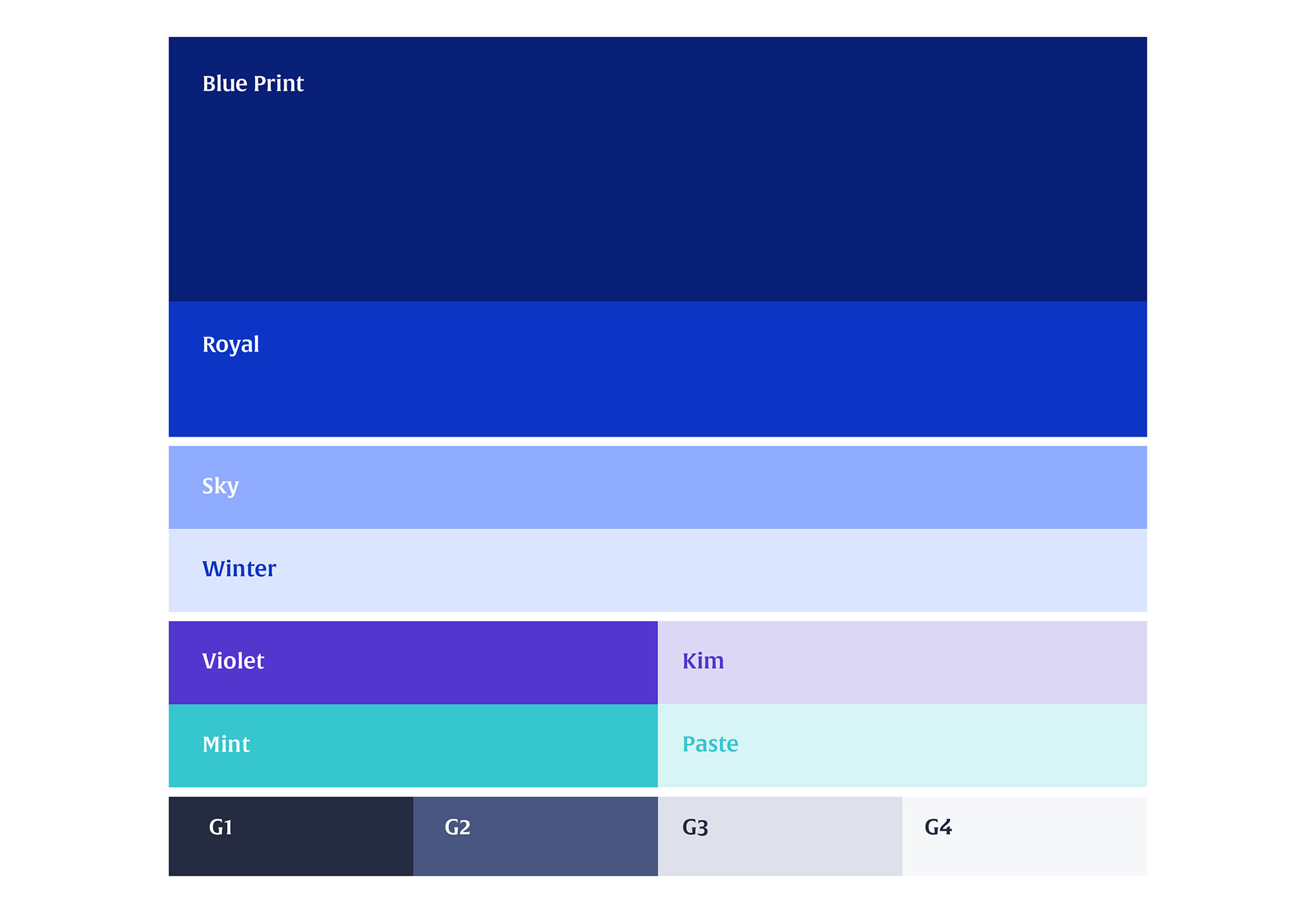
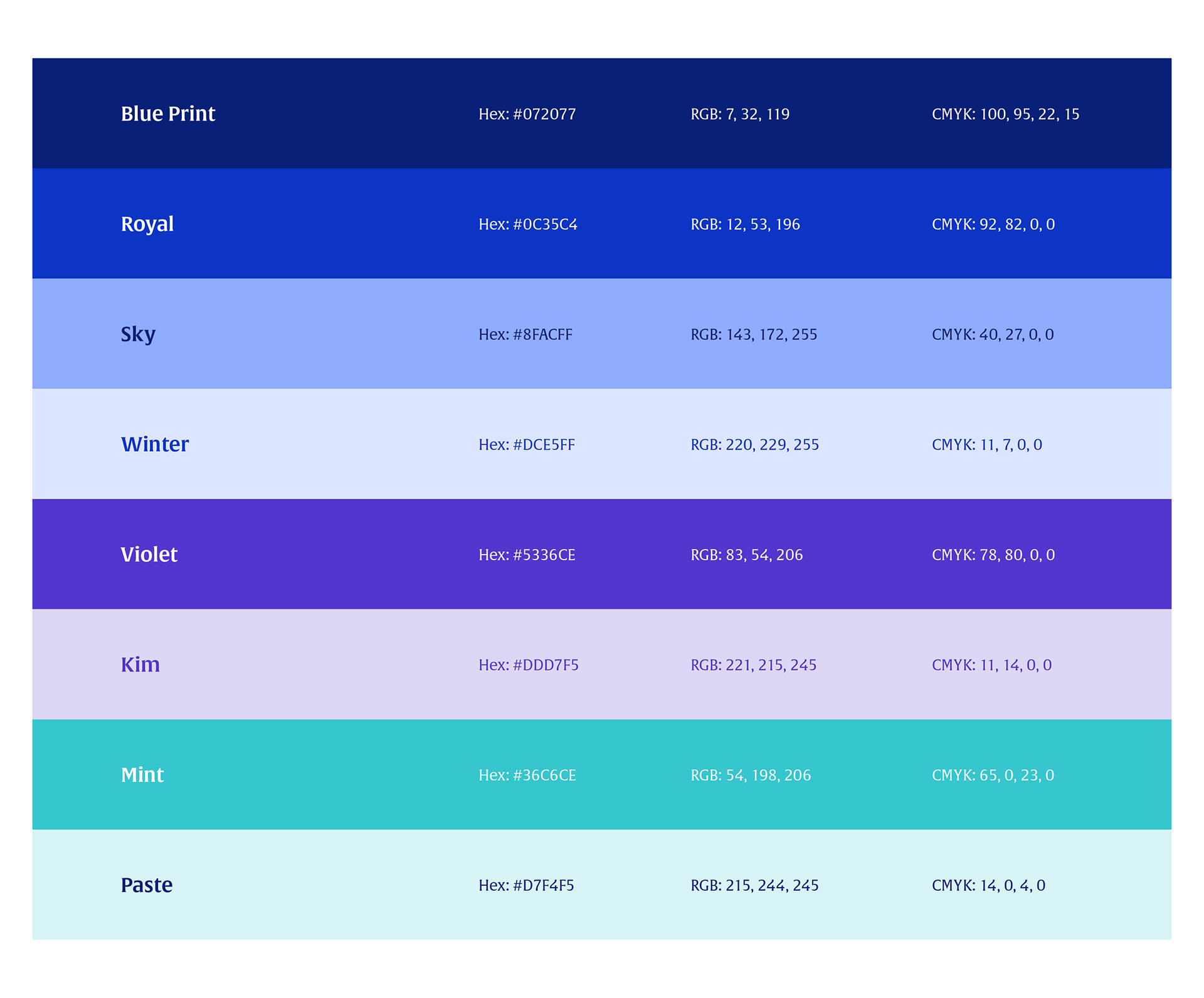
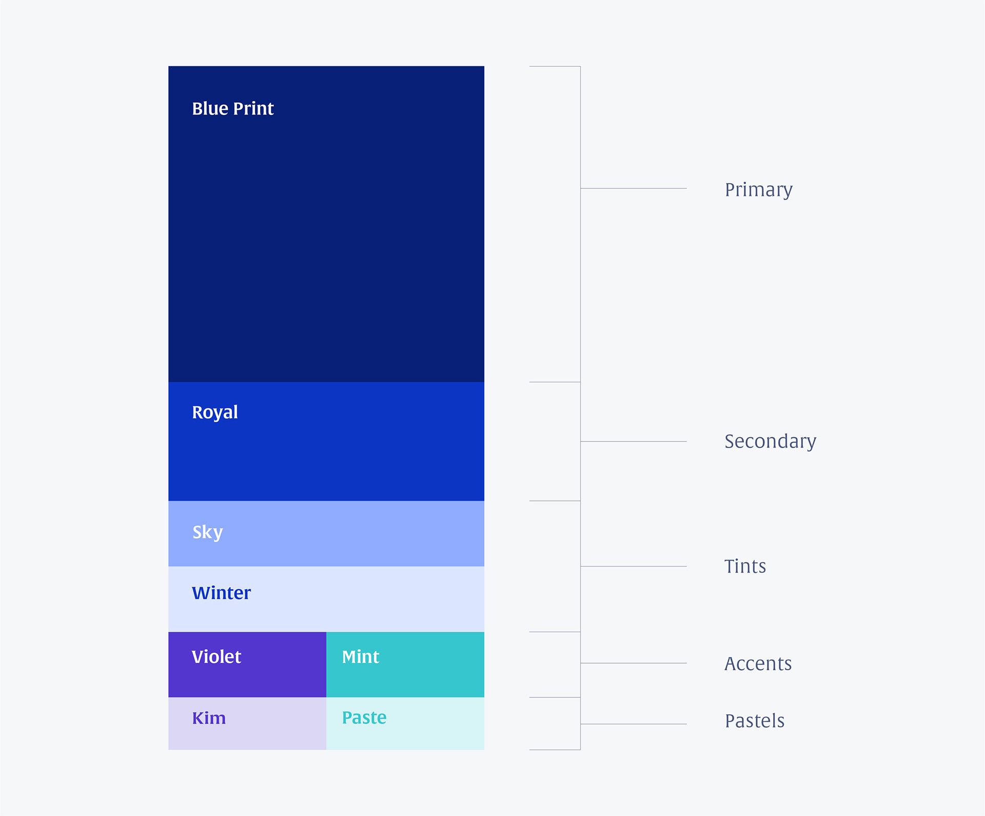
The colour system was developed to reinforce the same strategic qualities established during discovery. Rather than chasing visual novelty, the palette was designed to communicate trust, authority, confidence and stability. This gave the identity a stronger foundation for communicating with senior professionals and established multi-location operators.

Colour

Frames

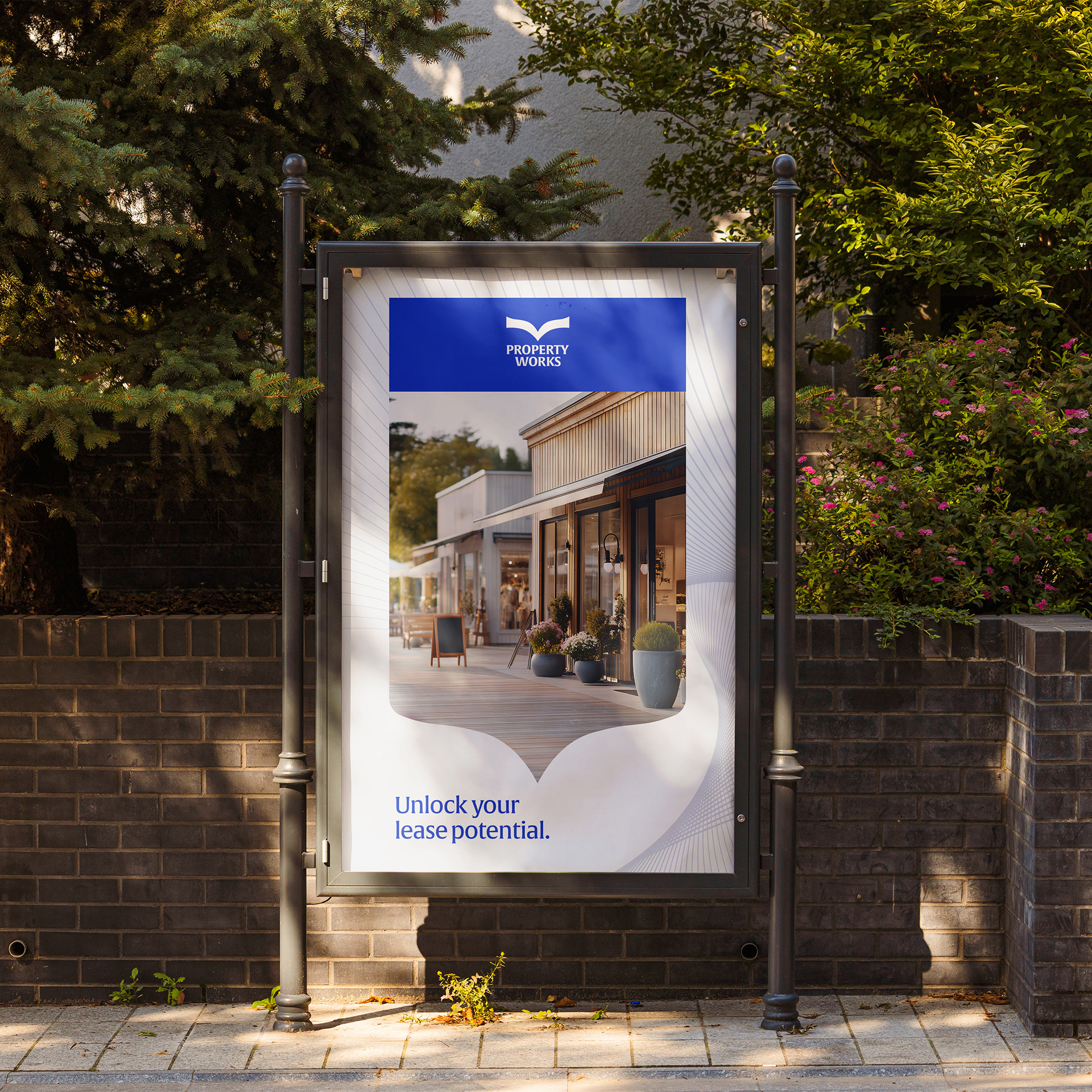
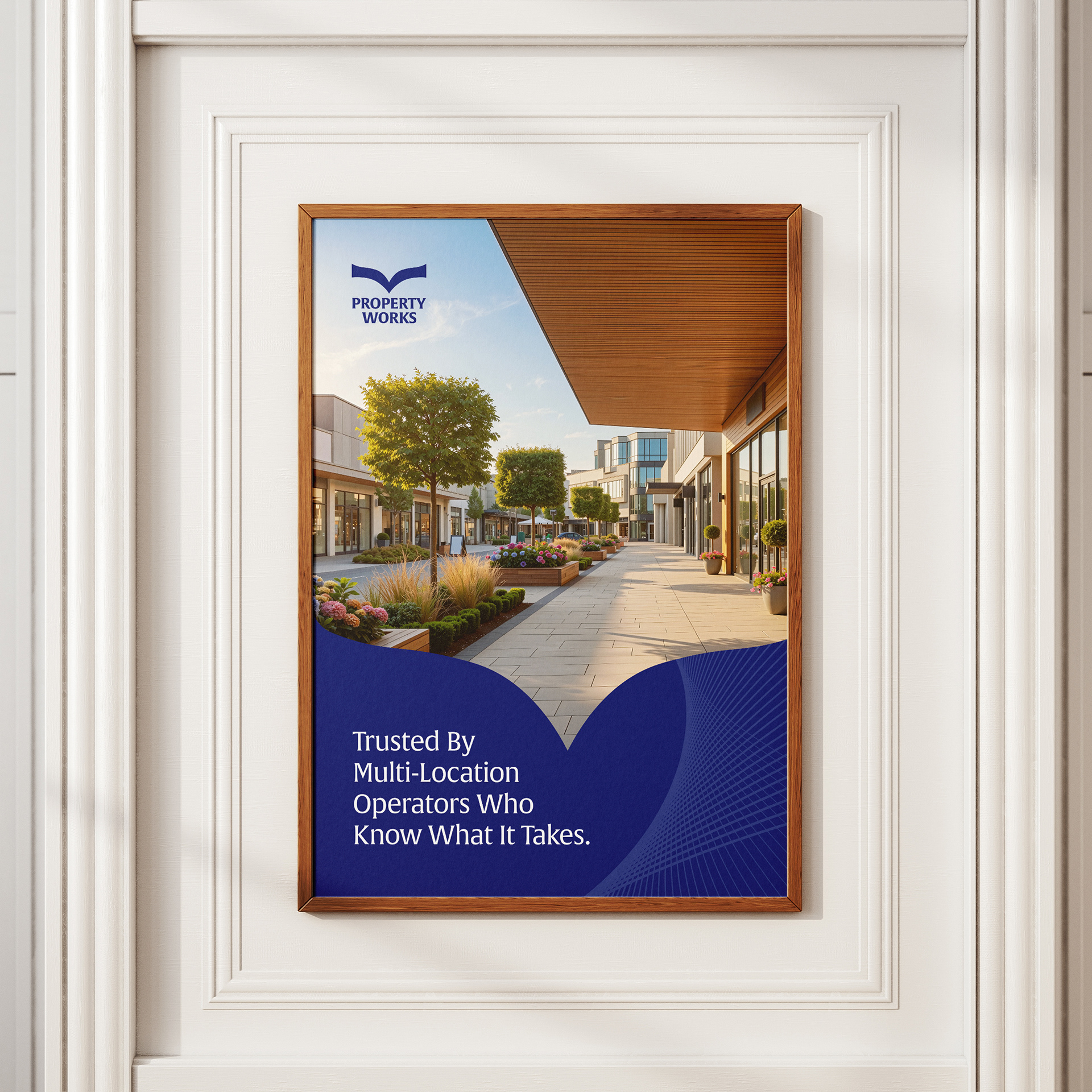
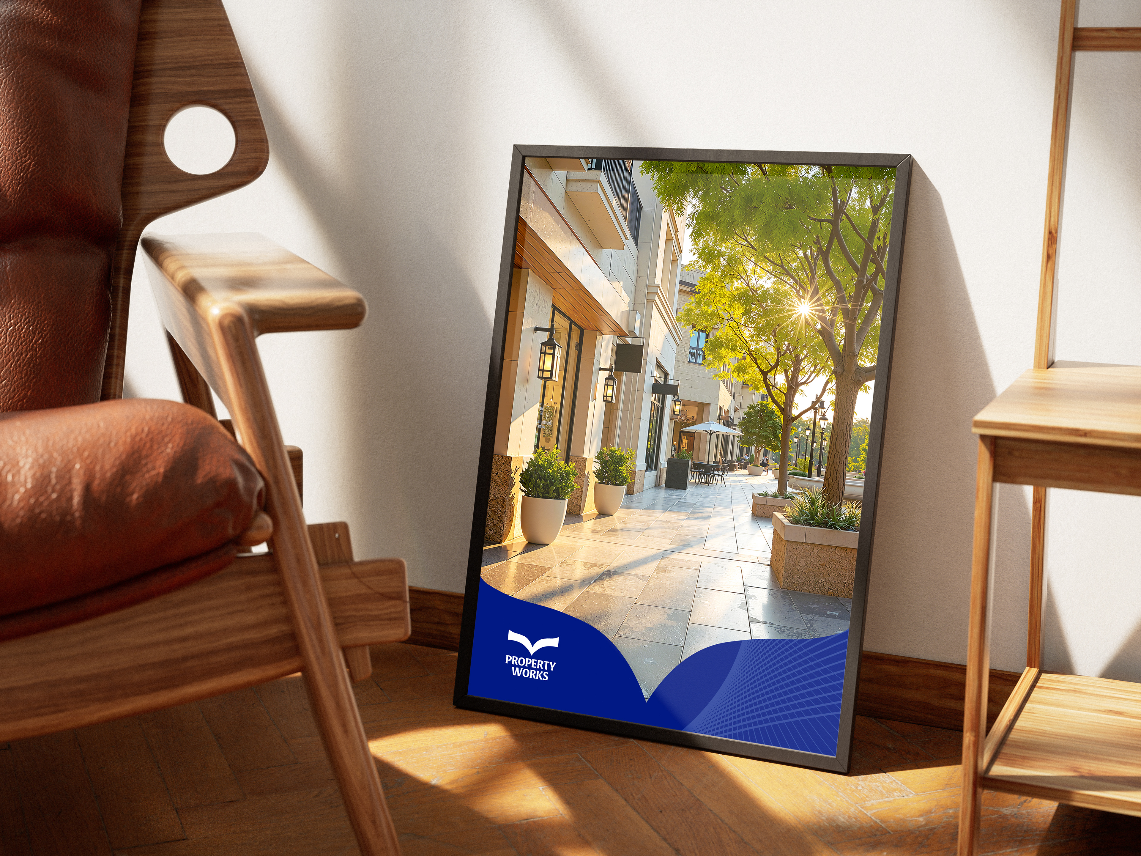
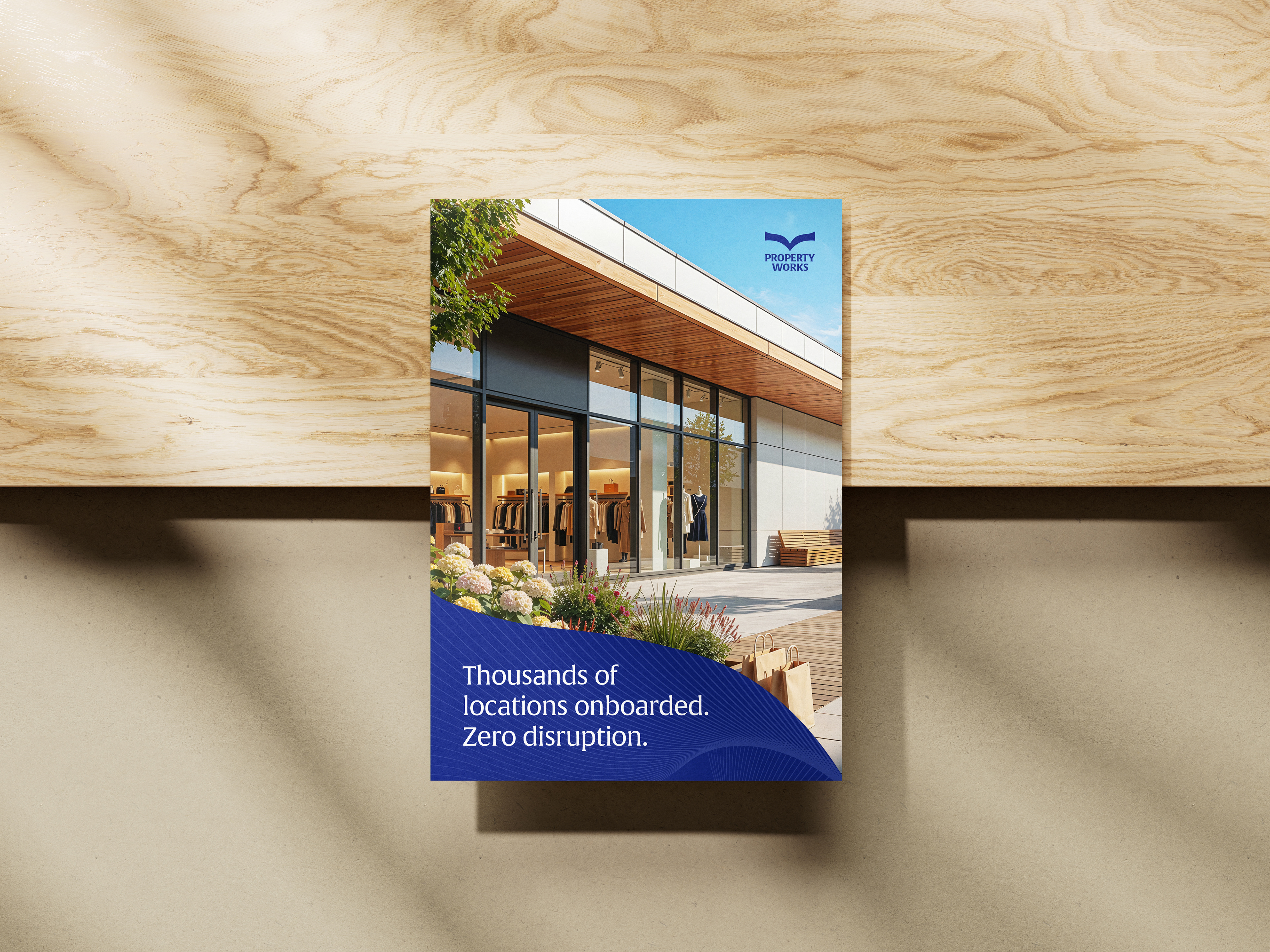
Key Visual






From Identity to Implementation
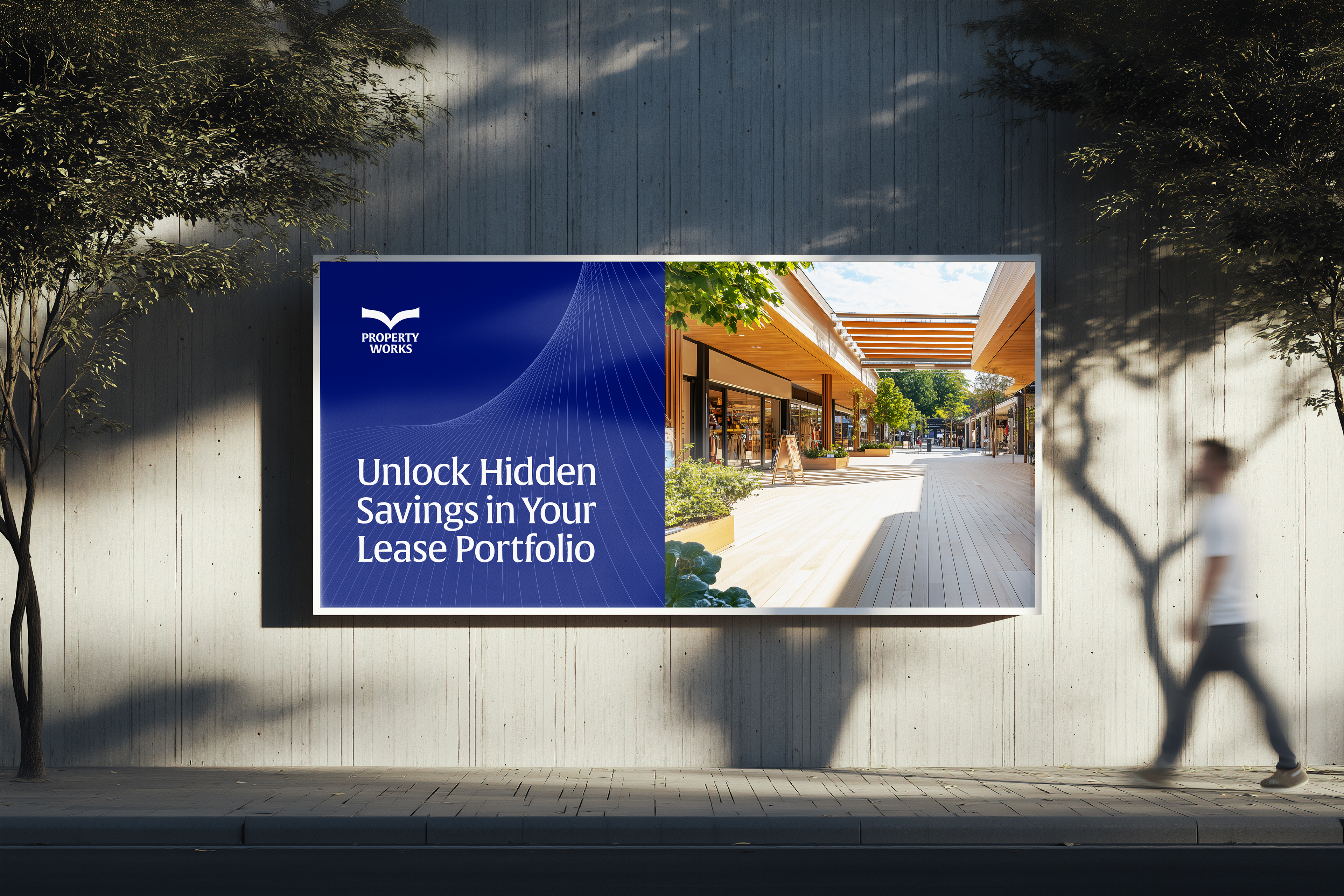
The work didn't end when the brand guidelines were delivered. As an internal design consultant, I worked alongside the Property Works team to translate the new identity into the organisation's day-to-day communications.
This included: Website implementation and art direction; establishing a consistent visual voice across social platforms; supporting ongoing marketing communications; and advising the internal team on brand implementation and consistency.
A brand system only creates value when an organisation can actually use it. The role therefore evolved from designing the identity to helping the organisation live the identity consistently. That relationship continues today.
The Outcome: A visual identity that finally reflects the organisation behind it.
Property Works already had the ingredients of a strong brand. It had: More than 30 years of experience; Long-standing client relationships; Deep operational expertise; A sophisticated service offering; Established relationships with major multi-location brands; and a reputation built through consistent delivery. The rebrand didn't create those qualities, it gave them a clearer visual language.
Today, Property Works describes its brand around many of the same principles that informed the transformation: consistency, credibility, confidence, clarity and trusted execution. Its current positioning emphasises its experience, its long-standing relationships and its ability to bring structure and control to complex portfolios. The identity now has a system capable of carrying those ideas consistently across the organisation.

Reflection
Great brand design cannot compensate for a weak organisation. But a great organisation can be poorly understood. That distinction became one of the most important lessons of this project. Property Works didn't need design to make it a better company. Its people, products, services and culture had already created the value. What it needed was a way to shape the narrative around that value.
That understanding could not have come from ascetics alone, It came from listening to the people who knew the organisation best. The conversations with management revealed a perception of Property Works that the existing visual identity simply wasn't communicating. Without those conversations, the project could easily have remained a cosmetic refresh.
We stopped asking: What should Property Works look like? And started asking: How should Property Works look if its visual identity accurately reflected what the organisation has become? That distinction changed the entire project.
Client: Property Works
Marketing & Brand Strategist: Tihannie Leo
Design Consultant / Art Direction: Sherlan Gittens
GrowthPad Team:
Web Solutions Manager: Derick Carlson
Solutions Architect: Tyler Walsh
Partner Agency: GrowthPad